5629 0 0
Gray wallpapers: 6 pluses and 35 boring design options
Many people associate gray with blues and facelessness, which is why it is so rarely chosen to decorate their homes. In this article I will try to break this stereotype. Namely, I will prove that gray wallpapers can exist both in combination and independently, and I will give successful examples of interior design in this color.
Advantages of gray walls

As a wall solution for living spaces, gray has the following advantages:
- Neutrality- against its background, both bright objects and furniture of muted shades look advantageous;
- Originality- due to the rarity of use, the interior in gray tones will not look like the situation in the neighbors' apartment;
- Available in a wide range of shades- the human eye distinguishes about 720 shades of gray, therefore, you can experiment with color saturation, bringing the parameters of your home closer to ideal;
- Counterweight- when there are rich colors in the surroundings, in their pure form capable of causing aggression, they must be balanced;
- Relevance- different shades of gray do not go out of fashion and are used in different styles of interior design;
- Durability- in case the surroundings are tired, there is no need for repairs, but it is enough to change the furniture and accessories, and the new room is ready.

Gray wallpaper will become a lifeline for all zealous owners who do not want to spend money on regular repairs once again.
Possible combinations

Due to its ability to adapt to other tones, the gray palette is organically combined with both flashy shades and calm ones. The combination of gray wallpaper with other colors dictates the character of the room. And vice versa, based on design goals, you can correctly choose the shade of the wallpaper, and to them - the right companion color.
With white

The combination with white is very common. The choice of shades for this combination depends on the purpose of the room. For a comfortable environment, light gray tones in tandem with white are suitable.

To create a dynamic environment, pay attention to dark shades. Due to the similarity with black, they are able to add drama to the room.
With black

Dark gray walls combined with black objects or accessories improve brain performance. Such a tandem is ideal for a study, home library or teenager's room.
With beige

The union with beige helps to create a serene environment. Both tones are neutral and complement each other perfectly. However, to enliven the room, it is recommended to use bright elements - orange, green, blue or purple.
With blue

Gray wallpaper in combination with blue or decor items will add brightness to a monotonous entourage. The same applies to canvases with a blue pattern. The warmer the shade of blue, the more cheerful the atmosphere will be.
with green

Green also has many nuances - from "flashy" to noble.
- To refresh the room in gray tones, it is enough to apply light green or mint shades;
- To give sophistication to the interior, it is necessary to appeal to deep variations of green.
with purple

The union with purple is very fruitful, because it carries a lot of decor options. When choosing a light finish for the walls, you can give preference to both delicate and medium varieties of purple. Dark walls are in harmony with various shades of purple - from medium to saturated.

This tandem can be diluted with white or black, without violating the harmony of this combination.
With red and orange

The combination with warm tones enlivens the room.
- Orange adds brightness and improves mood;
- Red brings emotions and awakens temperament.
Do not overload the room with bright colors. Use them only as inserts, not dominant elements.
With pink

In combination with pink, you can achieve a variety of effects - from delicate to spicy. Gray wallpapers with pink flowers look especially fresh. Take this example into service if you are the owner of a dwelling with insufficient lighting.
with yellow

The union with sunny yellow will make the surroundings more emotional and awaken the vitality of those present. Actively use this combination in the kitchen and dining room, but do not overdo it with the amount of bright color.
With hints of wood

One of the most colorful options is the combination of gray wallpaper in the interior with wooden surfaces. It can be a beautiful wooden floor or exquisite solid wood furniture.
To make the room seem warmer, give preference to a tree with a bright color, for example: cherry, rowan, alder, walnut, mahogany, rosewood, teak.
With gray

The simultaneous use of several shades, from light to dark, makes it possible to model the space. Thus, you can correct the shortcomings of the room. For example, a narrow room can be expanded by decorating long walls in light colors, and short walls in dark ones.
Kitchen finishing options

Based on the features and parameters of the kitchen, gray wallpaper in its design should be used with caution. For example, in a small or poorly lit room, wall decoration with dark-colored canvases is unacceptable. It is also recommended to avoid large patterns.

Fragmentally connect juicy shades to decorate the walls. Green, yellow, orange blotches in some parts of the room will make it more cheerful. Bright colors will also help to realize the zoning of space.

To highlight the dining area, use canvases with a pattern. The most popular stripes and floral motifs.

Wallpaper with text looks original, especially if the message is humorous or has something to do with the residents.
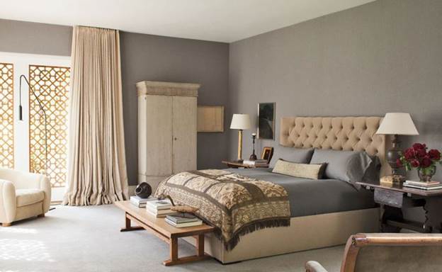
Bedroom design

Light gray wallpaper in the interior of the bedroom will come in handy if you set out to decorate it in a classic or Provencal style.

If you prefer modern styles, go for dark gray wallpapers. A prerequisite for such a design is the presence of several light sources.

If you are the owner of a spacious bedroom, feel free to paste over the walls with canvases with a large print. It can be floral ornaments, geometric shapes, abstractions, classical patterns. Curtains for the bedroom can repeat these patterns or contrast with them - in a large space, both techniques are acceptable.

The monotonous wall covering in the bedroom can be diluted with small bright patches. These can be pillows, bed covers, nightlights and floor lamps, bedside tables and bedside poufs.
Living room decoration

Wall decoration in gray is a great solution for a living room of any style. If until now your living room could be classified as “typical” or “unremarkable”, then in this design it will take on a luxurious look.

Walls in light shades are an excellent backdrop for paintings or panels.
Cold tones can be used in the living room if it is sufficiently provided with lighting. Ideally, this is the presence of huge windows with natural light. Warm variations of gray will fit perfectly into a small space.

The saturation of shades and the presence of patterns in the decoration of the walls depend on the style of your living room. For example, modern trends (minimalism, loft, modern, high-tech) do not allow accents on the walls. Thus, shades can be chosen both light and dark, but a large print will be out of place here.

Others (Provence, country, classic, art deco), on the contrary, welcome large details and various patterns. In this context, gray wallpapers will be in light colors and with a large pattern.

The living room should look both concise and chic, utilitarian and cheerful. And if wall coverings often act as a background, the rest of the functionality should be achieved in other ways. Namely, with the help of furniture, accessories and textiles.
How to choose curtains for gray wallpaper

Deciding on the choice of curtains will not be difficult. The color of the wallpaper, due to its versatility, allows the use of materials and colors of any kind.


So, which curtains are suitable for gray wallpaper depends on your goals:
| Type of curtains | Pursued goal |
|
|
|
|
|
|
|
|

As for the shape and size of the curtains, you will have to reckon with the style of the room. Classic, Roman or English, cropped or hanging down to the floor - it all depends on the look you are going to create in the room.

Conclusion
I hope you are convinced that gray wallpapers can make the interior harmonious if you follow the rules for combining with other tones. Now you have live samples before your eyes and it will be easier for you to decide on such experiments at home. Share your experience in the comments to the post.
December 11, 2016If you want to express gratitude, add a clarification or objection, ask the author something - add a comment or say thanks!
Wallpapers of this color occupy a leading position among the finishing materials of recent years. Moreover, various variations of gray are successfully used in both classic and modern interiors. Many world-famous designers have drawn attention to its rich palette.
Wall design features in gray

The popularity of gray in the last couple of years is due to its versatility. It can influence the mood of the interior, create a calm, relaxing atmosphere on its own, or emphasize the brightness of other shades. Not without reason, from the office version, he migrated to houses and apartments. At the peak of fashion, wallpaper colors "wet asphalt", "lead", ashy. Silver wallpapers also proved to be very popular (see the photo below):

It is difficult to find a shade in the color palette that would not be combined with it, and this is another advantage of gray (photo):

Such a variety allows you to choose the color of the wallpaper, based on many conditions - the size of the room, darkness, its functional qualities and one of the important criteria - your taste. You can leave a monochromatic gamut.


But there is an opportunity to dilute it with both pastel and bright colors.


Choosing gray for wall design as the main or auxiliary color, you can take advantage of the fact that it looks great in large areas. If you need to be careful with bright yellow or purple, then it is simply impossible to go too far with gray.
The right shade will be good in the design of any room, whether it be a bedroom, living room or children's room. And the use of this color for decorating the hallway is the perfect solution:

Calm, deep shades of gray can immediately seem harsh, rough. But modern designers have long moved away from such stereotypes and embody wonderful interior ideas based on these tones.
A gray bedroom can be fashionable, and at the same time cozy (photo):

The living room, whose walls are decorated with gray wallpaper, often becomes a favorite place for receiving guests and spending family evenings:

And even from the baby’s room, with the right choice of shade and additional accents, it will exude tenderness and warmth:

If the gray color is defined, then it personifies nobility and elegance. It has depth, mystery and unobtrusiveness.
But designers appreciate it not only for these qualities, the gray palette is a lot of neutral and versatile tones, which means you can use any combination. It is able to enhance the brightness and emphasize the tenderness of a light color.
What are the rules to rely on so that the combination of wallpapers turns out to be harmonious, and which combinations are not the best option for decorating certain rooms? There are many nuances, it is worth considering the variations in more detail.
How to combine gray wallpaper
Almost all neutral shades can be a good backdrop for rich, vibrant tones. But gray in this sense also has disadvantages - with excessive brightness and catchiness of accessories or finishing materials, it will enhance their severity. Therefore, experts recommend not to get carried away with extreme colors when combined with gray wallpaper. Even one or two bright spots against its background can “revive” the interior and at the same time look very harmonious:
It is also important to decide on the style of the intended interior and choose the right tone. If you take it at random, then the result may not please you - a dark gray, earthy color in some cases makes the room gloomy, and a too pale, blurry tone - boring, faceless. To avoid this, it is worth taking the experience of professionals into service. When choosing gray wallpaper, they are based on two combination options:
- Any light pastel, muted tone pairs with gray and is a great design addition.
You can give an example of combining pastel pink and light gray wallpaper. The bedroom turned out to be very cozy (photo):

Pastel shades give the room lightness and serenity. This is a great option for designing a place to relax and sleep - a bedroom.
Pastel smooths out its severity and asceticism, makes it more homely and cozy: (photo)

- Combination of bright colors.
A more risky option, where gray wallpapers and interior items can be the basis, or "calm" intense shades. In this case, you can get an overly catchy composition, but with a balanced approach, the apartment will become the standard of style and taste.
Various combinations of gray in the interior
There are many design ideas for decorating walls with gray wallpaper, sometimes they are so incredible that they evoke a variety of emotions. But it is not always worth following fashion or trying to experiment at random.
Gray-brown interior
Combining shades that are close to each other in the palette is a difficult task, since in this case the colors can merge into one spot. But with a combination of brown and gray, the latter color can simply “get lost”, losing its expressiveness. In this case, it is not recommended to use contrasts.

The combination of light gray and dark brown tones turns out to be calm, sometimes even very. Shades absorb each other, the interior can turn out to be boring. You can correct the situation by using several shades of brown in the design of the room at the same time. This color combination can be very interesting:

Also, adding white accents to gray wallpaper and brown will help get rid of the dullness of the interior. They will add light and airiness to the room (photo):

Gray and white in one interior
Modern designers quite often resort to such a combination. However, the nature of the interior depends on which shade is used. The light gray tone of the wallpaper in a duet emphasizes the whiteness of the companion color. This combination makes the room more spacious and bright:
Dark gray is contrasting:


This combination is suitable for both large and small rooms. A kitchen in this color will look very neat:

A small living room, as in the photo, will visually expand.

If it seems that something is missing in such a color combination, you can always dilute the interior with furniture or accessories of a different color.

Perfectly fit into the gray-white design of the plant, their natural juiciness looks quite natural:


Gray wallpaper combined with a blue palette
Gray and blue wallpapers harmonize perfectly, however, they depend on the saturation of the shades.
The combination with rich blue, turquoise may seem very strict and even rude. From such an interior breathes strength and masculinity:

But, on the other hand, such an interior cannot be called habitual and monotonous; individuality is felt in it.

If you want to make the interior more feminine, while maintaining the color scheme and intense blue, then you can use wallpaper with floral prints and ornaments in the design. This will add softness:

A completely different effect is obtained if the companion of gray wallpapers is light blue:

Two light colors create a fresh, cool interior, which will add comfort to home accessories - pillows or panels with embroidery, ruffles on curtains and bedspreads, floral decor.
Gray and blue wallpaper shades of the same intensity create an even, calm atmosphere.


Gray and beige for decoration
A great option for lovers of stability and tranquility. The combination of two noble shades is perfect for an elegant, seasoned interior of living rooms, bedrooms, offices and even a bathroom:

I am not pretentious, these colors on the wallpaper will not drown out and will be able to emphasize the dignity of luxurious things - furniture made of rare woods, antique jewelry, beautiful upholstery, handmade accessories:


Grey-green interior
The combination of light gray wallpaper and green shades by all canons should be unsuccessful, as two neutral colors look bland. However, the calmness of the base tone allows the green to look light and fresh:


Not everyone is ready to choose gray - blue wallpaper in the interior. It seems to some property owners that such shades will bring gloom into the room, deprive it of home comfort and coziness. For other homeowners, gray wallpaper in the interior seems to be a manifestation of the “official” style, inappropriate in a home environment.
The photo shows a light blue silver wallpaper that will add real harmony and comfort to your home interior.
Attention! The selection of gray wallpapers in the urban interior and additional shades will allow you to create a complete and harmonious image.

Choosing the right accents and additional accessories allows you to achieve the desired goal.
Curtain design options
Professional interior designers are convinced that they help emphasize the exclusivity and individuality of the designed living space, regardless of its original size.

Advice! To make the used gray wallpaper in the interior look appropriate and harmonious, it is important to choose the right accents and accessories.
Any small detail should be thought out in the room for which light gray wallpaper in the interior is chosen. The color hue involves finding a balance between bright and rather delicate colors, which is complemented by a gray background. There is no need to have special design skills to bring any unusual ideas into reality.

Advice! After reviewing the websites of interior specialists, you can choose the best option for your house or apartment using silver wallpaper in the interior (you see the photo below).
How to saturate the interior with bright colors
Let's talk about how to choose details for decoration if dark gray wallpaper is used in the interior. A variety of shades of gray are perceived by professionals in completely different ways. It all depends on the degree of illumination of the room, as well as on the presence of additional shades. For example, we note that gray wallpapers can be supplemented with bright textiles.

Advice! An interesting solution would be a combination of silver color with other tones and shades.
Matching matte silver wallpaper with large black flowers can create an accent on one wall while maintaining a strict and discreet overall style.
Light blue wallpaper (pictured option) goes well with dark shades. Dark blue canvases can be complemented with pastel shades.

Advice! In order to understand whether a combination of light gray with other tones is possible, you need to pay special attention to the brightness of the chosen shade.
Dark gray wallpaper in the interior (photo below), professionals recommend "dilute" with light shades.
Attention! Cloths of light gray tones are undesirable to complement with dark and gloomy colors.

Fragments of brown, blue, burgundy, black colors can be used as minor patterns, otherwise the silver-colored wallpaper in the interior (pictured) will make the room insufficiently lit, “steal” square meters.

Interesting tips on how to correctly combine light gray wallpapers in the interior, photos of finished interiors can be found in the video fragment
What goes with light gray
Let's try to identify win-win options for combining gray (pictured) with other colors when combining several finishing materials for walls.
Let's start with the traditional palette of black and white. Matte silver wallpapers will match perfectly in such a situation. Given that the result will be too mundane, devoid of luxury and pathos, professional designers advise adding additional shades to this combination.

For example, gray wallpapers can be chosen with a small geometric pattern so that the interior being created is appropriate not only for minimalism, but also in a classic style. The photo shows a combination of white, gray, black colors in a modern interior. Such a tandem would be appropriate in offices, hallways.

Gray materials (pictured) look harmonious with white stripes, colors, patterns. This combination option is suitable for recreating an old (classic) interior.
If you bring red or purple tones into the interior, combining them with gray colors will make the interior more emotional and lively.

Attention! You should not overload the created residential interior with gray tones, you can limit yourself to minor inserts.
Pink elements in gray (pictured) will help create a harmonious and romantic atmosphere. Psychologists are convinced that it is the combination of pink and gray that allows a person to tune in to relaxation and rest. That is why such a tandem of colors can be used in the interior design of a living room or bedroom.

It is better to choose light pink shades, in which case the room will not look dull and faded. If you decide to give your preference to decorative materials with an intricate pattern, you can take gray canvases with green and pink flowers. This option will help you achieve freshness in the created design, emphasize the taste of the owner of the room.
Gray-blue canvases in the interior are suitable for those homeowners who do not like bright environments.

By combining soft blue tones with a gray background, you can enjoy a harmonious contrast. The room will be filled with lightness, freshness, some mystery.
The choice of decorative materials for gray walls with orange or yellow elements allows you to make the room more emotional, saturated with vitality. Combinations of this kind are mainly used when decorating living rooms, kitchens, since the combination of such tones stimulates the appearance of additional appetite.

Silver and gray wallpapers, chosen for decorating the room, can be supplemented with green, golden, olive, brown.
Advice! When choosing such a palette, it is advisable to use beige or white as an auxiliary color.
When choosing furniture for a room decorated with gray wallpaper, other details must be taken into account. For example, a white furniture set is suitable for a cold gray shade. With the predominance of wooden furniture in the interior, it is advisable to choose light shades. In this case, you can bring freshness into the room and eliminate the excessive coldness of the gray tone.

For modern design, interior design professionals advise purchasing glossy furniture with milky and white facades.
It must be remembered that the color of additional accessories and textiles should be selected taking into account furniture, wallpaper. Depending on taste preferences, you can think about the design of window openings, the color of pillows for the sofa, armchairs. The gray plain walls of the room can be complemented with bright patterned textiles.

Kitchen design option
If you decide to try gray wallpaper as your main wall decoration option, do not forget to take into account the amount of sunlight in this room. For example, in a dark kitchen, gray canvases with a large pattern will be out of place, they will make the room narrower. In order to avoid getting a gloomy room, you need to choose pale pink, green, yellow inserts for the walls in the kitchen. They will make it possible to perform zoning of space, make the kitchen spacious and bright.

If desired, you can use the patterned coverings on the wall to highlight the dining area in this room. For example, a combination of gray wallpaper with large and bright colors will look very original in the interior of a modern kitchen. To create a complete harmonious image, you can choose a pattern on the curtains to match the pattern used when decorating the walls.

It is better to choose light furniture in the kitchen in order to maximize this room. In a kitchen with gray walls, green, red, yellow inserts look great. They bring life and harmony to the room.

Bedroom in dark color
In the bedroom, light gray wallpapers have a harmonious look. They help you relax after a hard day at work. If you complement the gray tone with light pink shades, in this case the interior will be conducive to philosophical thoughts, it will become a real “refuge” for its owner.
Attention! The dark gray tone is only suitable for decorating the bedside area. Otherwise, the room will have a gloomy look, it will be impossible to rest and relax in it after a hard day's work.

In a spacious bedroom, you can purchase coatings with large ornaments and drawings. For example, grayish canvases with lines, colors, prints, geometric shapes, abstract images look interesting.

Conclusion
Dark color with the right selection of additional shades, accessories, will be an excellent option for decorating living rooms, corridors, offices. Professionals advise not to limit yourself to such tones, to “dilute” them with soft shades, softening the roughness of the tone, bringing a soft homely atmosphere into the room.
An interesting solution when decorating walls are gray wallpapers. In our minds, the word "gray" is usually associated with boredom and invisibility. However, designers around the world willingly use this color to create the most unusual images and interiors. What is the mystery of gray and how to apply it when decorating a room in such a way as to create the right mood?
What is the beauty of gray wallpaper?
Gray is close to white and black. But, unlike them, it is softer, moreover, it has countless shades. They can be matched to both warm and cold colors.

The walls of this color can become a background for interior items or play a decisive role in the perception of the room - it all depends on personal preferences. In the first case, soft, light shades are used (pearl, smoky), in the second, they opt for saturated colors - silver, steel, with a blue or bluish tint.

Psychologically, the gray color relaxes, inspires a sense of stability and peace. It smooths out bright color accents, but at the same time sets off other colors favorably.
In general, gray is a cool color. Wall decoration in light gray tones will make the room more spacious, visually push the boundaries of perception, and create a feeling of coolness.
The main advantages of gray:
- unobtrusiveness;
- elegance;
- a variety of shades;
- excellent compatibility;
- expansion of space.
However, using wallpaper of this shade, it is easy to go to extremes and spoil the room, making it boring, inexpressive or gloomy.

Common Mistakes
Applying gray color, take into account the following nuances.
- A dark gray shade will make the room gloomy and depressing. Apply this color should be dosed, as well as black.
- If the chosen shade looks too boring, choose a wallpaper with a pattern or an interesting texture.
- Gray is the color of sophistication and elegance. Frivolous flowers, ruffles and other intricacies do not fit him. Use geometric or graceful floral and abstract solutions when choosing accessories and patterns.
- Light gray wallpapers are used to create a background so that interior items look juicier and more attractive.
- If you are planning to create a calm and relaxing atmosphere in the room, the wallpaper can be used as a standalone color scheme for the walls. At the same time, they stop at shades of medium intensity - not too light and not too dark, observing the rule of the golden mean. It is better to use patterned coatings or companion wallpapers.
- Matte wallpapers are better for creating a background, glossy wallpapers are better for highlighting walls.
- For residential premises - a bedroom, a nursery - it is better to choose soft, warm colors. If you decorate the walls in the living room or in the office, then dark shades will help create a strict and formal interior that will not distract from work and communication.

As already mentioned, gray can be used in two ways: to create an interior in strict monochrome colors or as a background that emphasizes the main design decisions.

Interior in gray tones
Designers often use all shades of gray to create a strict office environment or relaxing, soothing interiors. The principle here is the same as when creating black and white interiors. The difference is that the "gray style" is softer and easier to create harmonious combinations.

For walls, wallpaper is used that is interesting in texture or with a relief pattern.
A large drawing visually brings the wall closer, a small one moves it away. Therefore, wallpaper with a small pattern is recommended for small rooms.

The color should be expressive enough. If the wallpaper is light, then they are emphasized with a glossy pattern. Furniture can be either light gray, almost white, or dark or close to black. To create soft, calm interiors, gentle shades are taken - for example, pearl wallpaper and gray furniture with a brownish tint. To make the room stricter, use pure cold colors: silver, steel, gray with a blue tint.

Here are some examples of how you can apply gray wallpaper in the interior of different rooms.
- Living room . In small rooms for pasting walls, wallpaper of light, coldish tones is chosen. It is better if they have a discreet geometric pattern. One wall can be decorated with companion wallpaper in a darker color. Massive furniture - a sofa, cabinets - are chosen several shades lighter, almost white. For contrast, two or three dark gray objects are placed in the room - a coffee table, a TV, an armchair. On the floor, you can put a carpet with a brownish tint. If the room seems too dull, complement the interior with sofa cushions a few shades darker than the carpet or in the color of the chair. For large living rooms, darker furniture, retro-style wall murals, or a newspaper print on one of the walls are suitable.
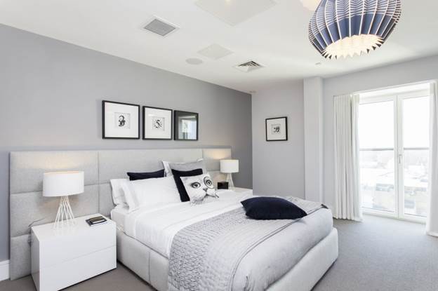
- Bedroom . For lovers of bright bedrooms, plain pearl wallpaper with companion wallpaper at the head of the bed is recommended. Furniture can be several tones darker than the main wallpaper, and a blanket or bedspread can be light. For those who feel more comfortable in a semi-dark bedroom, we can recommend gray wallpaper with a brownish tint, a dark carpet, a dark gray bedspread and lighter furniture.
- Kitchen . Gray in the kitchen creates a feeling of cleanliness and radiance. Kitchen sets of steel or silver color with many chrome parts have long been loved by housewives. Wallpaper in bluish or neutral tones and a dark gray floor will help to emphasize them. The options look very nice when the walls and floor are made in the same color scheme. In this case, contrast is needed - a table that differs in gray intensity, bright chairs, kitchen utensils.
- Bathroom . This room is performed in delicate or silvery shades. A white bathtub and sink provide a nice contrast to the walls and floor, which can be done with stone or tiled tiles. To create a highlight, you can use an interesting frame for a mirror or an artsy light source.
- Hallway . Due to its small size, the gray color in the hallway in its pure form is practically not used. The wallpaper should be light enough so as not to create the feeling of a closet. Be sure to dilute them with glossy surfaces or warm light colors of doors, mirrors, light wood floors, stretch ceilings with a lot of lamps. To highlight one of the walls, you can hang pictures with a bright color pattern on it.

In a nursery, gray looks boring, unless you use it as a background. Let's take a look at which shades go best with gray and how best to use its ability to set off other colors.

Gray walls as background
Neutral gray goes well with almost all shades. We note the most interesting pairs.
- Purple or lilac. The number of such items should be limited, otherwise the room will look tasteless. The brighter the purple color, the darker the wallpaper on the walls should be.
- Pink . This combination is appropriate in children's rooms and romantic bedrooms.
- Blue . This tandem can look too cold, so it is livened up with small accessories in warm colors or interesting patterns.
- Yellow . A very cheerful combination, but there should be less yellow than gray. Wallpaper choose a rich color with a touch of steel. This pair looks great in the kitchen.
- Red and orange also need to be used in dosage. In order not to overdo it with the brightness of the color, some of the red items can be replaced with beige ones. Red and beige, combined with platinum-colored wallpaper, are suitable for living room interiors.

Gray can be combined with brown, but here you need to carefully select shades. Light gray color will accompany all the tones of light wood, and taupe goes well with rich red-colored furniture.

Choosing furniture
Furniture for gray wallpaper is selected, focusing on the following rules.
- Objects with glass surfaces and chrome details are suitable for wallpaper in cold shades.
- The color of the furniture should differ from the color of the wallpaper by several tones in one direction or another.
- Natural wood is quite difficult to harmoniously combine with gray walls. It is necessary to carefully select the shade of the wallpaper: it should be light enough, with brownish tones. Brings the walls and furniture together with a wooden floor or a brownish carpet. The use of wood in the interior significantly softens the gray scale.
- The classic combination is gray walls and white or black furniture. This interior looks very strict, so it is more appropriate in offices and living rooms.

Theoretically, the furniture can be of any color, but it is necessary to choose the appropriate shade of the walls. There should not be too many objects of bright colors, otherwise the charm and elegance of gray wallpapers will be completely lost.

How to choose curtains?
What curtains are suitable for gray wallpaper? There are several options, and they all depend on how bright the room needs to be.
- In rooms where you want to create a calm, relaxing atmosphere, it is better to use neutral-colored curtains - white, light gray, pale silver. To highlight the window opening a little, curtains can be sewn from satin or brocade fabric with a sheen. When decorating a room with purple or pink furniture, the same shades can be applied to the curtains, but make them pastel.
- To create strict monochrome interiors, black and white curtains or steel-colored curtains are suitable.
- Curtains of bright colors - red, burgundy, orange, yellow - can be used in small rooms as the only color accent in combination with figurines, decorative vases, pillows and similar trifles. In large rooms, bright curtains can complement a sofa or armchair of the same color.
- If the curtains are bright or dark colors, then it is better to choose a fabric without a pattern - this is required by strict gray walls. In bright interiors, curtains can have a small or large pattern, but it should not be too prominent.

They also follow the general rule: curtains should not merge with the walls. With the same color, they can be several tones darker or lighter than the wallpaper.

Little tricks
A non-standard solution would be pasting the walls with stripes of different colors. For example, a combination of gray and pink will create an interesting tandem. In this case, one wall can be decorated with companion wallpaper with a large pattern of the same colors. Skillfully repeating them in pieces of furniture, you can get a very nice room - bright and at the same time soothing. Curtains for such a room are chosen in plain, gray or pink, and furniture is the opposite of the color of the curtains.

And finally, a few more useful tips.
- Gray color harmonizes well with decorative stone, brick imitation, ceramic tiles. This combination is used in bathrooms, hallways, living rooms with a fireplace.
- The gray background is perfect for the implementation of a fashionable idea - large flowers on the entire wall. It will delicately highlight the main pattern and smooth out the contrasts.
- Black accessories in a gray room will add rigor and formality.
- Pure white accessories in gray interiors look unnatural. Preference is given to dusty white tones.

So, the gray color of the walls is the perfect background for the implementation of almost any design decisions. It will perfectly emphasize interior items and at the same time smooth out unnecessary contrasts, and it will not be difficult to choose elegant curtains for it. Acting on the psyche softly and soothingly, gray wallpaper will be appropriate both in the bedroom and in living rooms.

When arranging a dwelling, sooner or later the issue of wall decoration is raised. Today, wallpapers are back in fashion. Many buyers are faced with the difficulty of choosing wallpaper for the bedroom, because the modern market offers an incredibly rich and varied range.
Gray color is one of the fashion trends in interior design. However, the attitude of designers and ordinary people to gray is ambiguous. Some contemporaries consider this color boring and dull, others classify it as a group of refined and elegant shades.
If we return to the classical definition, then gray is a sign of wealth and discreet luxury, refined taste and style.

The psychology of color
Choosing the color of the wall decoration is one of the most important moments in the arrangement of the bedroom. Not only the mood of a person, but also his well-being depends on which color was chosen. In the old days, the bedroom was called the bedchamber, because it was here that a person rested. If you choose bright and flashy color variations for this room, then it is unlikely that you will be able to relax and sleep there.
According to the recommendations of psychologists, calm neutral shades are best suited for the bedroom, which help to balance the psycho-emotional state of a person, relieve stress and move away from problems for the rest. It depends on the color how cozy and comfortable the situation in the bedroom will be.

photos
From a psychological point of view, the optimal solution for choosing a color scheme for a bedroom is gray. It symbolizes peace and tranquility. In the 19th century, this shade was considered a sign of nobility and power. Many gentlemen of that time wore tuxedos made of various shades of grey. Therefore, definitions such as "boredom" and "despondency" have nothing to do with this color.

Combinations with shades
The uniqueness of gray is in its versatility. Both its independent use and combinations with various shades from the color palette of paints are allowed.
The saturation of the color affects the depth of the shade, so in nature there are light gray, neutral gray and dark gray. By combining different shades, you can create a beautiful monochrome pattern. Wallpaper with monochrome patterns will look harmonious in the interior of the bedroom, especially if you hang dark gray curtains on the windows.
Also very interesting are the colors that appear as a result of a combination of gray and some other shade. For example, today the color of a dusty rose, the shade of wet asphalt, the color of a stone dried out by drought or the sky during a thunderstorm are popular. Various metallic shades of gray are best used as a decor for wallpaper.


You need to be able to choose the right shade of wallpaper color for the bedroom. So, for a southern room, muted and darker tones are better suited with the addition of shades of blue or blue, which will slightly “cool” the room. But for the "northern" bedroom, on the contrary, choose light shades of gray. Neutral and soft warm colors (gray in combination with milky, light beige, creamy white) will make the bedroom more cozy and comfortable.

Often designers and ordinary consumers are interested in what color a gray tone will look harmoniously and interestingly. Let's take a look at some of the more common color combinations:
- White. Suitable for modern interiors that are decorated in Art Deco, Hi-tech, Modern, Minimalist styles, etc. Can be complemented with black. Depending on the arrangement of flowers around the room, the overall atmosphere of the interior changes.
- Blue. The best solution for a bedroom with windows facing south. It is found to decorate a room decorated in Scandinavian, nautical or classic styles.
- Pink. This combination is interesting from the point of view of the design of the bedroom. Both colors are rich in various shades, which allows you to beat this combination in different styles. For example, a combination of pastel pink and light gray harmonizes well with a shabby chic bedroom.
- Yellow. Most often used by designers to decorate the walls of the "northern" bedroom. The combination is warm and cozy, respectively, a calm and comfortable atmosphere will reign in the bedroom.
- Green. Favorable color combination solution for wallpaper in the bedroom. Gray color gives peace and tranquility, and green well enlivens the interior, makes it more cozy and comfortable, adds harmony and peace of mind. In such a bedroom, a person will feel calm and relaxed.
- Red. This combination is rarely found in the interior of the bedroom. If you want to add passion to the interior of the room, then you can safely choose this combination, since it has an exciting effect on the human psyche.

The peculiarity of the gray color is that it harmoniously looks both in combination with various bright shades, and with calm pastel colors. Also, gray is ideal for combination with decorative elements imitating natural stone or wood.
Style orientation
The second feature of gray is its compatibility with a large number of styles:
- Modern fashion trends (Minimalism, Hi-tech, Loft) it is impossible to imagine without shades of gray in the interior. In addition to wall decoration, designers recommend using this color for floor and ceiling decoration. So that visually the room does not become one gray spot, the gradient method is applied, that is, the transition from light to darker tone.
- Ethno-style is a step towards naturalness. However, the use of a gray tint is not due to unity with nature, but, on the contrary, the desire to combine ethnic motifs with the bustle of the city.
- Light Provence, Country Shabby chic- from these style directions it breathes romance, tranquility and peace. Gray color will add sophistication and elegance to the interior of the bedroom, it will harmoniously combine frivolity and rigor.
- Retro style and classic trends seem a little gloomy and dull. Gray color will allow you to slightly unload the emotional perception of the room. At the same time, it will emphasize the compositional harmony and strict style of interior design.


Selection rules
When choosing wallpaper for the bedroom, it is important to decide in what style the room will be made. This nuance will help you make a choice in favor of the type of wall covering. Wallpaper for the bedroom can be:
- plain;
- combined;
- with pattern;
- wallpaper.
Since the bedroom is a place where people spend most of their lives, everything in this room should be environmentally friendly and not endanger human health.


Important is the tool that is used for pasting walls with decorative wallpaper. In the old days, when wallpaper paste was considered a huge shortage, people used paste. Many use it at the present time, considering it the safest material. But high-quality modern wallpaper must be glued with high-quality raw materials, otherwise the wall covering can be ruined.


")


