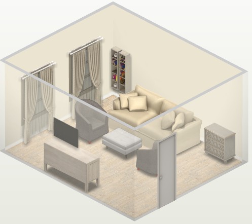
Curtains can be almost invisible, or, conversely, very catchy. Sometimes curtains are more of a functional element (they protect from light and prying eyes), and sometimes they are only decorative. Of great importance is the color of the curtains - it is he who determines what effect will be achieved.
It depends on what result we want to get. And also on the stage at which the interior is ready, we proceed to the choice of textiles. If the interior is already furnished and decorated, curtains can be chosen for any, absolutely any of its components. If the interior is under development, we need to choose one of the four schemes and, in accordance with it, carry out further work on the project.
Curtain color selection: four basic schemes
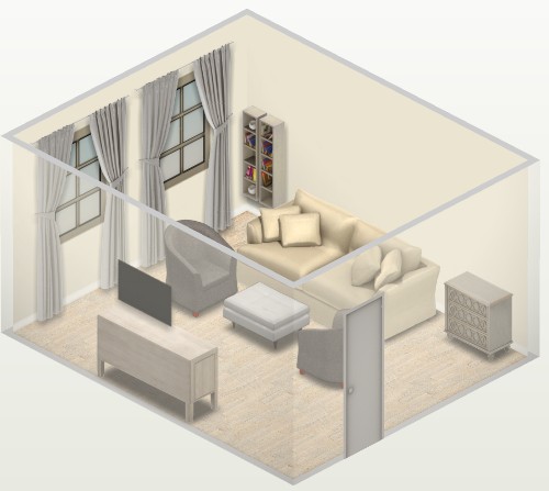
1. Curtains to match the color of the walls
This elegant solution is absolutely versatile and win-win. The color of the curtains can match the color of the walls or approach it. Different saturation of shades is possible: for example, dark beige curtains can be matched to light beige walls.
What are the benefits of this scheme? This combination is aesthetic, harmonious and safe. No need to worry about whether the curtains will be combined with carpet, upholstered furniture, decor. They are related to walls, and that is enough.

Under what to choose curtains? Under the color of the walls

Walls and curtains merge into a single line, making the room seem larger. That is why this scheme is recommended for small rooms, as well as for rooms with several windows.


This combination option will be optimal even if the interior contains several different colors and textures. Catchy curtains will add variegation, which will create the effect of confusion. Curtains in the color of the walls, on the contrary, will calm the atmosphere.
For a monochrome, serene interior with plain walls, you can choose curtains with ornaments. They will make the interior more expressive and interesting.

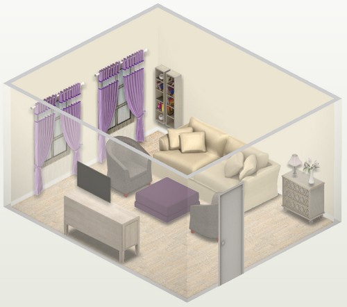
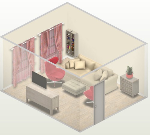
2. Colored contrasting curtains
Such curtains are a kind of exclamation point, adding expression and spectacular brightness to the interior.
This is the most daring, and therefore rather complex scheme. It is important not to make a mistake with the chosen color.

This plan is especially good for calm and even more boring interiors. Contrasting curtains are an eloquent touch that magically transforms the atmosphere.

If deep-colored curtains seem too bold, you can decorate the windows with pastel-colored curtains.
3. Curtains in the color of the interior as a whole
Many interiors, even if they contain several colors, can be described in one word: for example, gray-beige, bluish, black and white, in caramel colors, etc. Curtains of the same “arithmetic mean” color are suitable for such rooms.

Under what to choose curtains? Under the interior as a whole


Even if the curtains contrast with the walls, they still will not become too catchy. Such curtains practically dissolve in the surrounding space.
4. Neutral curtains
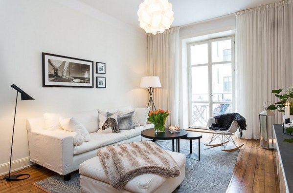
These usually include white, cream, and light gray curtains. They are suitable for most interiors. If you are in doubt about the choice, stop at this neutral scheme.

Black is also a neutral color, but when it comes to the interior, it can hardly be called universal. However, in some situations it will be quite appropriate. For example, in a white Scandinavian-style interior.

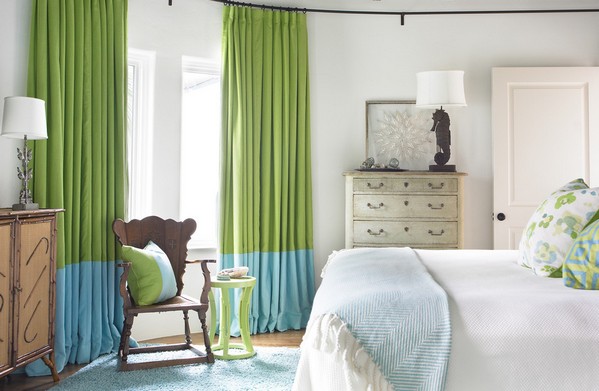
Curtains "two or three in one"
If a scheme with colored curtains attracts, but there are doubts that it will be successful, it is worth considering another interesting solution - bicolor and tricolor curtains. For such color combinations, there is an established term - color blocking (color blocking).

The main part of the curtain fabric, as a rule, is neutral, repeating the color of the walls or the interior as a whole. At the same time, a wide accent strip adorns the top, middle and / or bottom of the curtain, echoing other contrasting elements of the interior.

Choice of scheme and color
If the interior is being developed, as they say, from scratch, it is advisable to immediately decide how you would like to see it: monochrome-calm or contrast-expressive. In accordance with this, a decision is made on which of the schemes will be taken as a basis.
Under the color of the walls
Under the interior as a whole
Colored contrasting curtains
Colored contrasting curtains: option 2

Three in one
How to choose a color if it is decided to make the curtains colorful and contrasting? It is logical that preference should be given to the range that is most attractive and pleasant to the owners of the premises.
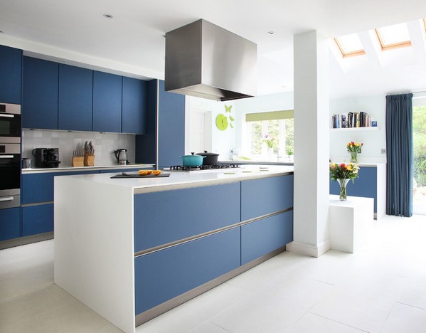
If there are already colored elements in the finished interior, you can choose curtains for them. For example, in a living room that already has a blue sofa, blue curtains would be appropriate.

Under what to choose curtains? For existing furniture

What to combine curtains in the interior?
What details can be used to support curtains? What do they usually rhyme with? The answer is simple: anything.
Curtains can overlap with carpet, upholstered furniture, headboard, lamps, cabinet furniture facades, decorative pillows, etc.


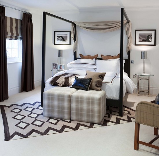
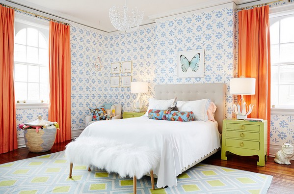
In the bedroom, the bedspread and curtains can be made in the same color. At the same time, it is desirable that the fabric be different. Otherwise, it looks like a curtain was put on the bed or a bedspread was hung on the window.
Not only furniture, but also textiles in the interior allows you to achieve comfort in the house. That is why it is so important to correctly choose the color scheme for window curtains. In this case, it is recommended to be guided by simple and understandable rules. For example, remember the ability of a warm range of shades to increase the amount of light in a room. Or, on the contrary, invite overly intrusive sun rays with the help of a cold spectrum.
Any designer to the question: “how to choose the color of the curtains?” will answer that it is not enough to combine the shade of wallpaper, furniture upholstery and textile elements in the interior. But there is another option, which implies the calculation of the contrast between all interior items. For example, bright sunny curtains contrasting with a black sofa.
It is more cost effective to duplicate the color of the furniture and curtains rather than to match the color of the walls. After all, the replacement of household items occurs much less frequently than repair work. However, if the issue of saving is not in the first place, you can confidently sew curtains to match the wallpaper.

Ideal Solution
It is not necessary to proceed when choosing textiles for reasons of compatibility with everything together. Experts agree that the largest or brightest object should occupy the dominant position in the interior. A huge soft corner or a chic kitchen set can be chosen as the base. If you associate the color of this base with the shade of the curtains, the result for any design will be winning.

Neutrality is always in fashion
Photos of curtains of a beautiful color, belonging to a neutral range of shades, suggest another profitable design solution. Beige, cream or white canvases on the windows will harmoniously fit into any interior, and will also suit people with different financial situations.

How to connect decor elements to each other?
Even a neutral-colored fabric bought to decorate a window opening can be connected to the rest of the items in the room. To do this, it is enough to sew draperies or inserts on the curtains of that bright color that matches the design elements.

Window in focus
It happens that a room cannot boast of the beauty of individual elements. In this case, it is advisable to push the window opening to the fore. He emphasized his bright striped or checkered curtains. It is important to repeat the color of the curtains in all components of the room. For example, in the lining of pillows, a lampshade or bedspreads.

All the colors of the rainbow
The most creative personalities create a real riot of colors at home. Tones and shades in the same room sometimes simply hurt the eye. To balance this variegation, it is worth sewing soft curtains, preferably in a muted color. The walls of the room, or at least one of the walls, should act as a base.

The realm of monochrome
The monochrome interior looks elegant and graceful, accentuated by equally graceful storms. The color of textiles in this case should be a couple of tones darker than the main color in the room. A real find will be combined curtains that do not fade against the background of upholstery and walls.

Color as a means of visually changing space
Those who intend to change the size of the room with the help of curtains should remember: warm shades visually make the window closer, therefore, the room begins to seem a little larger. This rule also works in the opposite direction: the cold spectrum allows you, as it were, to move the window opening away, while at the same time reducing the spaces.

How to choose the color of curtains for a separate room?
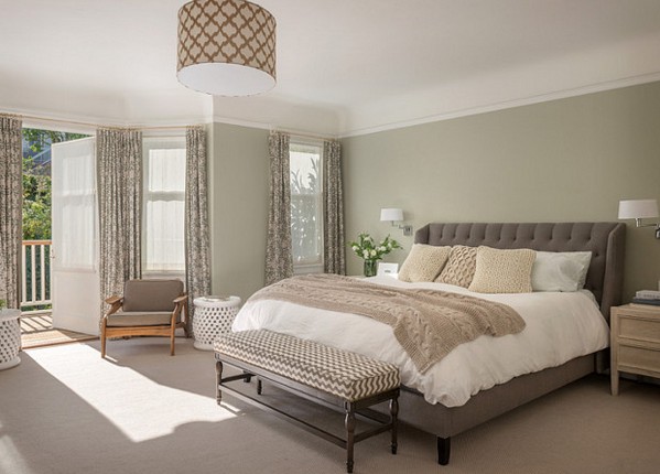
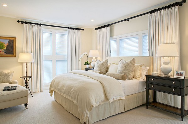
The bedroom carries a functional load, concluded in rest and tranquility. Therefore, it is best to curtain the metal-plastic windows in the bedchambers with plain curtains. In no case should you destroy the intimacy of the sleeping area with too aggressive or bright decor.
![]()
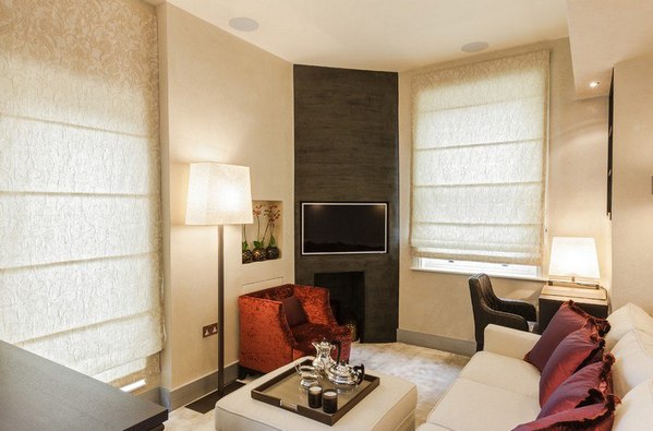
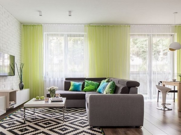
The living room appears as an experimental platform. It is on these square meters that it is advisable to combine catchy curtains with original bedspreads, as well as upholstery materials.

The kitchen, a kind of study of the mistress of the house, requires sufficient lighting for proper cooking. This need dictates a general rule for kitchen curtains: the use of extremely light and light fabrics.

What colors harmonize with each other?

Turquoise looks chic in any interior, but it is most advantageous to use this cool shade in combination with golden tones. Appropriately turquoise curtains look exclusively in rich houses.

Red color due to its aggressiveness should be diluted with pink or beige tones. Complemented with such an image, the red material will make any room cozy. With the help of coral curtains, you can easily shade natural wood furniture.

50 photos of the perfect color for curtains in the interior


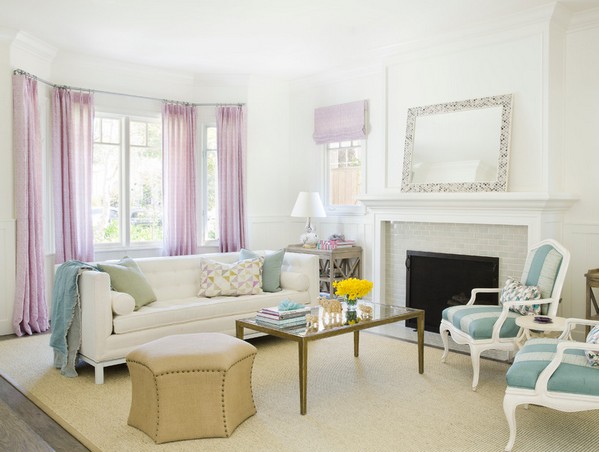
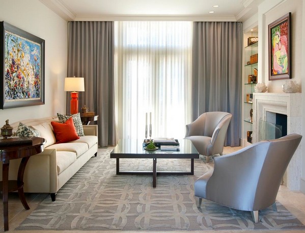
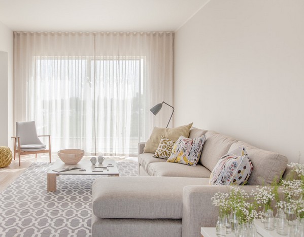
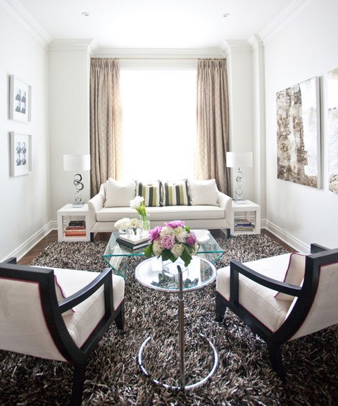
It is difficult to imagine a living room without textiles: soft upholstery, smooth lines and curtains in the living room that create and complete the image. The right design of curtains for the living room refreshes the room and attracts attention.
Curtains in the interior both emphasize the dignity of the room, complement it, and show flaws if the color or design of the curtains is chosen incorrectly and the overall style is not respected. There are not as many requirements for living room curtains as there are for kitchen ones, but they must be resistant to fading if the room is located on the sunny side.


The choice of curtains for the style of the living room
Curtains on the windows in the living room create their own atmosphere, protect from sunlight and prying eyes. With their identical functionality, they are very different and, with the right selection, fit into the interior of a living room of different styles.
- , as a rule, straight and without sticking in a light shade of beige and white, as well as in pastel shades of green, red, purple. The fabric of modern curtains for the living room can be either natural or made using modernized technologies, the main thing is that it is plain or with large geometry.


- combine light tulle and heavy thick curtains. On the one hand, weightless organza lets in daylight, and on the other hand, opaque curtains decorate the wall and protect from prying eyes in the evenings. This is a very practical solution, which is why many owners with invariable good taste turn to the design of curtains for a living room in a classic style. Any fabric material and texture is acceptable here.


- create a feeling of nature and simplicity of the province. Colors should be fresh and juicy, but not bright. Preference should be given to the color of ocher and terracotta. Provence curtains in the interior of the living room should be made exclusively from natural fabrics: linen, cotton, chintz with floral embroidery, floral elements of bright colors, stripes and checks are allowed from patterns. To create Provence, ideally there should be a large window with retractable sashes.


Choosing curtains according to the color of the living room
When choosing the color of the curtains, it is necessary to build on the size of the room, the amount of light in it, the layout and the height of the ceiling.
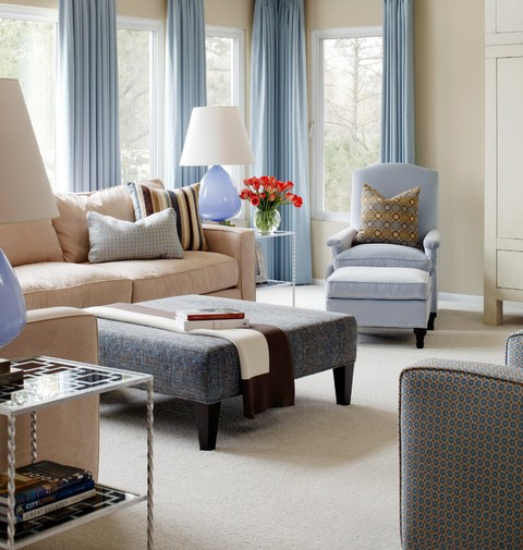
- emphasize the beauty and style of a neutral steel shade. White color in milky and yellow shades will complement the image. Pink, yellow orange and peach will become a bright shade and add light, comfort and softness to the living room interior. The most successful solution for a sunny room would be the choice of blue and lilac curtains in delicate tones, this will refresh the room, and decorative pillows in the color of the curtains will complete the look. A win-win option would be to choose a neutral beige, sand and coffee color of any tone.


- should be milky and brown to complement the style of the room, or they can be turquoise, soft purple, fuchsia to create an expressive accent. Bright textures, satin and velvet will create a vintage style, while transparent and modern fabrics are suitable for modern style, minimalism and high-tech style.


- Curtains in the white living room you can choose any, it depends on the style of the room. For a classic design, white thick curtains, tapestry with white tulle, brown and coffee curtains, beige and sand are suitable. This design will muffle the white walls and create coziness. Bright colors (pink, light green, lilac, blue, orange) draw attention to the window opening and make it the main one in the interior.


There are basic rules for choosing curtains in the living room by color:
- choose the color and shade of curtains depending on the color and texture of the wallpaper (if you choose curtains in the same palette with wallpaper, they should be 2-4 tones lighter or darker than the walls);
- the color can match the color of the furniture or the largest item in the interior (sofa or carpet);
- the design of curtains and pillows with one fabric will create a unity of style;
- cold shades (blue, green) are suitable for a small living room and make it visually wider, while warm ones (orange, red) are more suitable for large rooms (as well as a large pattern);
- cold colors are suitable for rooms on the sunny side, and warm ones will fill the interior of the living room with light.


Create the effect of additional energy. In cherry and wine shades, they are suitable for a large living room, and complement a small living room in combination with light-colored fabrics.

They are combined with white and beige walls, but are forbidden for combination with blue and purple colors in different shades. Suitable for spacious rooms with large windows.

Suitable in a light shade or a combination of white and blue for a small room, and in a spacious living room you can combine velvet blue drapes with a gold garter cord.

Types of curtains in the living room: from tulle to lambrequin
- let the sun's rays through and are decorated with beads, clips, hairpins and beads. Threads of different colors in combination create a composition and complement each other. For the living room, it is better to choose threads from linen and silk.


- are a popular window decoration because of the flowing lightweight fabric, which is easy to wash and attaches to any curtain rod, and the tulle on the grommets create even, identical folds.

- will be the right choice for a living room with a balcony door, which will make it possible to frequently move the curtain back without deforming it.


- it is better to choose a classic version to create minimalism, or cascading ones (with lush tails when opened) for a Provence-style interior and light design.


- they are placed above each window with a separate canvas on a common cornice with limiter rings, curtains at the outer corners are common to the entire bay window. Lush curtains with an unusual finish are suitable for the living room.

- Suitable for small and narrow rooms. They can be up to the windowsill or even shorter.

- beautifully mask all the fastening loops and the wall. They can be both classical and Roman. Lambrequin gives solemnity to the interior, draped with tassels and ribbons, it can be plain or combined. Today, more and more often they use not soft, but hard frame lambrequin.

Photo of curtains in the interior of the living room
The photos below show examples of the use of various options for curtains in the interior of the living room.

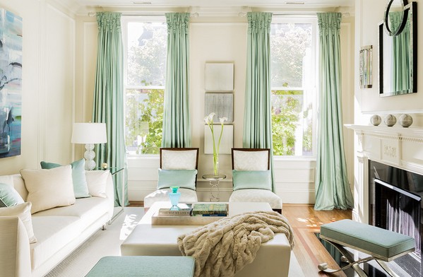
Photo 1. Straight curtains 3 tones lighter than the walls and light tulle on the grommets complement the living room in a modern style.

Photo 2. White classic and roller blinds in a light gray design make the living room interior airy and concise.

Photo 3. Flowing silver fabric emphasizes the richness of the lilac tone, and the white sofa dilutes the riot of colors.

Photo 4. The living room in beige is complemented by classic-style curtains to match the color of upholstered furniture and create a unity of design.

Photo 5. In the interior of the living room, coffee velvet curtains 3 tones darker than the walls are complemented by the same fringed lambrequin and look harmonious with a weightless crown.

Photo 6. Plain Roman blinds in the bay window protect the room from excess sun and make the room larger due to the simplicity of the design.

Photo 7. Blue curtains dilute the classic beige living room, and French curtains neutralize the blue.

Photo 8

Photo 9. In the interior of the living room, the bay window is decorated with solid weightless organza and light beige curtains that refresh the black and white accent wall.
- this is usually the final touch that helps us complete the image of the room. How to choose curtains for the interior so that they look harmoniously in the room, make it more comfortable, and, if necessary, hide flaws? It is worth paying attention to the design style, color, and material from which they are made. How to choose the color of curtains? It depends on what color your room was made in, on its dimensions, and also on its purpose.
Basic criteria for choosing a color
To decide on a color, you need to decide what exactly your curtains will be combined with.
- Under the color of the furniture. Most often they are matched to the color of the furniture. And this is practical, since we do not buy new furniture so often, respectively, and the curtains will not have to be changed.

The most common option is the selection of curtains in the color of furniture
- Under the color of the walls. These curtains look beautiful. But every time after the next repair, you will have to buy new curtains or constantly select wallpaper or paint of the appropriate color. If you still decide to purchase such curtains, choose a color that will be a little darker or a little lighter than the walls, otherwise they will simply merge into one. In order not to be mistaken, take a piece of wallpaper to the store. If your wallpaper is decorated with a large pattern, choose plain curtains. Solid wallpaper is combined with curtains, which can have a large pattern.


Curtains should be slightly darker or slightly lighter than the walls.
- They are combined in color with some large detail in the room, which also catches the eye. For example, if you pick up, they can be in harmony with the bedspread on the bed. Rooms look interesting in which the same detail, for example, a drawing, decorates not only curtains, but also other interior items: pillows, carpet, etc.
- White. The color of purity, which is also called the color of elegance. Thanks to him, the room seems filled with light and air, he pushes the space apart. But an overabundance of this color makes the apartment lifeless, so often its shades are used to make the room more “warm”, for example, baked milk. Psychologists say that this color helps to relieve tension, focus on the main thing, remove annoying thoughts;
- Brown. If you need to add nobility to the interior, brown is used. In addition, it is the color of warmth, comfort, it helps to create a feeling of stability and security;
- Red. Too powerful color, color of action. It can create an atmosphere of cheerfulness, encourage activity, but you should not overdo it, because. Many people associate it with danger. You can hang it in the living room if you plan to meet friends in this room, spend time actively. But it does not contribute to relaxation, therefore it is not suitable for the bedroom and for the nursery;
- Orange. It is a warm color, energetic, it attracts attention, uplifts and invigorates, evokes joyful emotions. Suitable for living rooms and kitchens, as well as offices, as it promotes mental activity, disposes to work.
- Green. Helps to relax, calm down, as many associate with nature. Ideal for bedroom and nursery, office;
- Yellow. One of the "warmest" colors, inspires joy and optimism, good for a child's room, as it stimulates activity;
- Blue and cyan. Removes aggression, overexcitation, helps to think clearly, create an intellectual atmosphere in the house. Gives a feeling of coolness. It stimulates the imagination, inspires a sense of trust.


A very interesting effect is created by a room in the design of which a similar detail is used on different interior items.
But it is not necessary to adhere to these rules; if desired, you can choose other curtains, for example, bright ones with an unusual pattern. Then the eyes of visitors will be riveted to the windows.
When choosing a color, keep in mind the fact that it can change in different lighting conditions. The interior of the room should not have more than 3 colors, so it will be easier for you to think over its design. If you want to fill the apartment with paints, consult with experts, they will help you choose the right combination.
Curtains in different rooms
Select curtains and depending on the size of the room. Dark colors are not suitable for small rooms, because then they seem even smaller. If you want to visually expand the room, you need to buy light and cold colors. Cold shades visually move the window away, the room seems larger, while warm ones, on the contrary, move the walls closer, making the atmosphere more cozy, comfortable, and the room visually smaller.
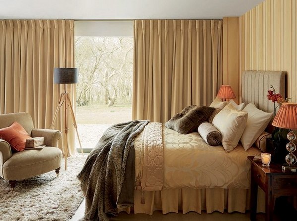
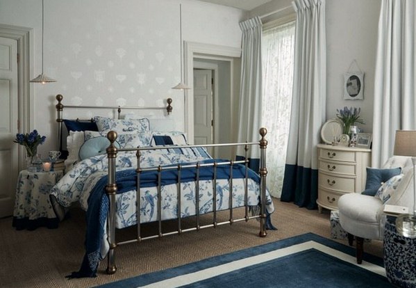
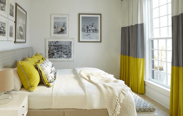
Bedroom
How to choose the right curtains for the bedroom? Remember that, first of all, this is a recreation area, so flashy colors will not be appropriate here. If you cannot imagine a room without such shades, you can use them in the design of accessories. It is better to take curtains in muted shades that will contribute to relaxation: blue, blue, green, delicate cream tones and pearl shades will do.

Green, blue and blue colors are perfect for decorating the bedroom.
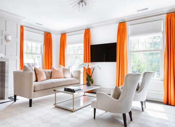
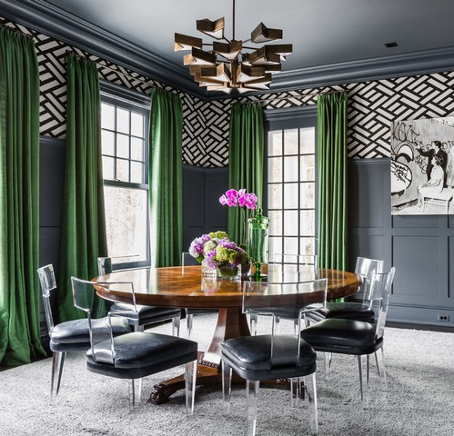
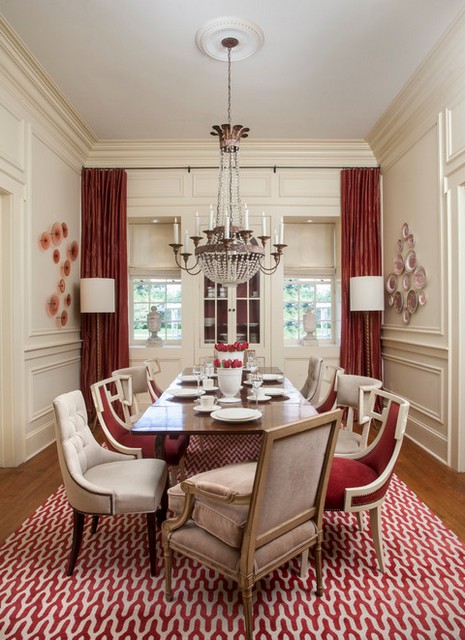
Living room
What curtains will look good in the living room? The choice of color for this room is not limited, this is exactly the part of the apartment where any design and any color will be appropriate. The main thing is the selection of curtains for the interior, that is, they must be in harmony with the environment. If the style is airy, creates a feeling of lightness, then the textiles should be the same, with the effect of flowing fabric, which, as it were, can “flutter” from any gust of wind. If this is a classic style, then choose curtains that emphasize solemnity, made of heavy fabric, trimmed with fringe and tassels. In the living room, lush textiles are most often used, for which expensive cornices are selected.

Any colors are appropriate here, even red or orange, but many choose a noble brown
Kitchen
What color is better to take curtains in the kitchen? Most often, housewives choose light-colored curtains that make the room visually larger (many kitchens have small sizes) and do not prevent the penetration of sunlight. What colors and patterns should be on these curtains depends on the style in which the room is decorated. So, if this is a country style, you can hang curtains with flowers, or choose a fabric in a cage, a strip. High-tech style suggests that the curtains will be cold shades.

Light curtains will make the kitchen visually larger
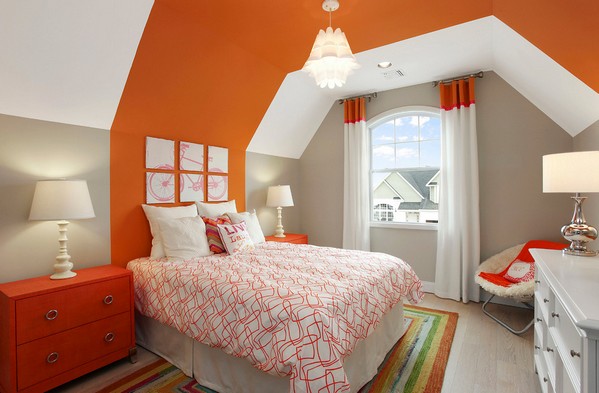
Children's
To pick up curtains in a child's room, you need to remember that very bright colors will annoy him, distract him from lessons, while too monotonous ones usually bring boredom. The color is selected depending on the design of the nursery. If they have drawings, then they should be large, and if the drawing is small, then only non-contrast, otherwise the child's eyes will be uncomfortable. Curtains should be practical, without draperies and pelmets that will collect dust.

Green, blue and blue, and yellow are the best colors for a nursery.
The psychology of color
Choosing curtains by color, it is important not only how they look in the interior, but also what effect they have on a person. Let's talk about it in a nutshell.
We told how you can choose the color of curtains for the interior. But if in doubt, not sure, you can always consult with designers who will help you design an apartment in a certain style. The main thing is that you feel comfortable and well in your home, that you like the way it is furnished. The apartment should tell guests about the tastes and preferences of the owners, and not just be a set of rooms copying photos from glossy publications.
If it seems that the interior of your apartment is tired and inspires melancholy, then it is time for repairs. But do not rush to panic: it is not as difficult as it seems at first glance. It is often enough to update one or two details to make the home sparkle with new colors: for example, wallpaper and curtains.
Their choice should be approached no less carefully than other elements of the situation. Even if you liked the color in the store, this does not mean that it will look attractive in the apartment. Inappropriate material will also introduce dissonance.

Skillful use of color play will add zest to any interior. If you find the perfect combination of curtains and furnishings, then it will be a pleasure to be there!

Color selection
Choosing the color scheme of the interior, many make the same mistake. Beige, gray and other discreet shades are considered a win-win option, but they look faceless and boring. The room in these colors will be more difficult to give individuality.


On the other hand, do not overdo it with brightness. Too many eye-catching accents will make the room too colorful, which will also be tiring. Look at the photos of the curtains in the interior: what interesting combinations they form!

When choosing, consider the direction of the world that the windows look at. Depending on how much natural light enters the room, the appropriate fabric and colors change.
- If the windows face east, use cool shades.
- Natural gentle will look better in the west.
- For the north side, light and light colors are suitable.
- Add bright and juicy accents to the southern room.
- Using light and cold shades will visually enlarge the room, while warm ones will make it smaller.

You can choose different color combinations for curtains and interior:
- Use a single palette (red and pink, blue and cyan);
- Echoing colors (pink, lilac, purple);
- Play in contrast: white with black.

The main function of curtains is to protect from sunlight, so the choice of fabric should be based on its intensity.

Look at the purpose of the room: simple curtains will look in the kitchen, and it is better to leave heavy curtains with decoration for the bedroom.

Under the influence of ultraviolet radiation, wallpaper and curtains fade, so it is recommended to change them at least once every 5 years.


Room selection
Heavy curtains with golden ruffles will look good in a classic style room. On the other hand, curtains can help make heavy furniture lighter, making the room brighter.

Provence welcomes the floral pattern and the continuation of the wallpaper pattern on the curtains. A minimum of details and pretentiousness rely on a minimalist setting.

A geometric pattern, on the contrary, can be chosen in a room in the Art Nouveau style. Neutral wallpapers are needed for bright curtains, and restrained colors for embossed wallpapers.

When choosing tulle for curtains, do not forget that their colors should complement each other, and not merge. For example, dark brown curtains and cream tulle will be a good combination.

You should also pay attention to fabrics: tulle made from natural threads needs the same curtains (for example, made of cotton or linen). Some styles welcome the use of velvet and velor. A suitable combination of curtains and tulle can be found in a room of almost any style.

Roman blinds are combined with antique, classic, country interiors. They are perfect for a nursery.


Choice of wallpaper color
Beige
To the ever-actual beige color of the walls, you can pick up curtains in the same colors, or you can make a contrasting accent on them. Suitable red, gray, silver-pink, olive colors.


Chocolate, green and wine are combined with warm beige. Silver, gold, lilac and blue will suit a cold shade.

White
With white walls, you can combine absolutely any color of the curtains. In spacious rooms, choose them from light fabrics: tulle, organza, silk.

Yellow and red colors are equally good in the living room and kitchen. Green is refreshing and soothing, so it is suitable for the bedroom and nursery.

gray
Blue and blue curtains are combined with gray walls. Peach and yellow will add coziness to the room in these colors. Black and purple will appeal to fans of unusual solutions.


Greens
The combination of white curtains and green walls is a contrasting classic. A wonderful combination of greens will create with brown and blue. The red version requires some care, as it is easy to overdo it with brightness.


Blue
If you have blue wallpapers, you can decorate a marine interior: use a combination of red, blue and white. Also purple and gold.

For turquoise walls, it is better to choose cream, light yellow shades of curtains.

Lilac
Lilac is a rather rare wall color. It can be stylishly combined with mustard, purple, white or gray curtains.

yellow
Look for blue or sky blue curtains. Lilac and terracotta colors will make the interior softer and warmer.

Pink
Light pink walls look very stylish in the company of gray and white. An “appetizing” interior will result from the combination of pink and chocolate.


Photo combination of curtains


 in the near future - forecasts and expert opinions")


 in the near future - forecasts and expert opinions")


