Turquoise wallpaper will refresh the interior of any room The choice of turquoise wallpaper in the interior speaks for itself - turquoise belongs to the cold shades, so turquoise wallpaper is used to create a fresh and cool design. Turquoise color has a positive effect on mood, promoting relaxation and rest. For many, wall coverings in such colors are associated only with a marine style, but turquoise shades will fit into any interior design.
Turquoise wallpapers: filling the interior
Turquoise wallpapers in the interior can rightfully be considered chameleons. Since the color in combination with different lighting and other shades can be either delicate and light, or brighter and more saturated. Subject to the peculiarities of style, wall coverings of turquoise tones can fit into any interior atmosphere.

Turquoise wallpaper will be a great option for the bedroom: in addition to the fact that they soothe the psyche, they can increase the space
The advantages of marine wallpaper in the interior:
- Bedroom. The turquoise color in the interior of the bedroom, in combination with delicate tones and airy materials, will emphasize a quiet and calm atmosphere. This combination is perfect for a relaxing holiday after a hard day's work and will help overcome insomnia. Also, the marine theme in the bedroom goes well with any furniture and modern interior items. The bedside area can be highlighted with turquoise wallpaper with patterned ornaments, pasting them behind the head of the bed. And make the rest of the walls in the room in light and pastel colors.
- Living room. In the interior of the living room, turquoise-colored wallpapers give the room comfort and freshness, and combinations of several tones of blue emphasize the mystery and romance of the design. If there are other shades of colors in such a room, then try to choose the tones in accordance with the layout of the room. For example, in a room located on the south side, use bright or dark inserts, and in a small room, use light shades to the maximum. Do not be afraid to experiment with bright shades, in such an interior they will note sophistication and style.
- Children's room. When decorating the walls of a nursery, psychologists do not recommend using turquoise. This can affect the baby's physical activity. It is better to glue wallpaper in turquoise tones in the form of rich inserts in the game part in combination with other bright colors.
- Kitchen. In the kitchen interior, turquoise shades play an ambiguous role. The dining area can be decorated with bright and light tones of turquoise, which will energize and embody the fresh natural atmosphere of the room. But in the cooking zone, it is preferable to use cold and dark colors. Saturated shades will protect the walls from dirt and stains and contribute to concentration.
- Bathroom. The turquoise color of the walls in the bathroom will perfectly harmonize with white plumbing and white tiles. Although wallpaper is rarely used in such rooms, one should not forget that high-quality coatings, for example, non-woven wallpaper, will not only decorate the walls, but also protect them from mold and moisture. In addition, the sea color of the walls represents freshness and is regarded as an ideal option for relaxation.

You should not buy wallpaper only in turquoise: a much better solution would be to buy wallpaper with a pattern in a different tone.
When decorating the interior of any of the rooms, remember that the turquoise range of shades can play both a primary and an auxiliary role. It is desirable that the room has a combination of both light and bright accents, which can be arranged with the help of accessories, decorative pillows or selected curtains.
Turquoise living room: decoration (video)
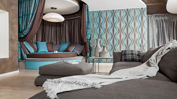
Wallpaper turquoise with a brown pattern in combination
For turquoise wallpapers, you need to carefully select the appropriate background and tones, as well as objects and decor elements, in order to maintain the integrity of the entire interior.

In order for the brown room not to be dominated by an oppressive atmosphere, it is worth adding notes of turquoise color to it.
The turquoise color of the walls is harmoniously combined in the interior with natural pastel colors, for example, the combination of turquoise with a brown pattern will add sophistication and grace to the room. Such a composition in itself looks elegant and sophisticated, but you should not cover the entire room with turquoise-brown canvases, otherwise you will end up with a rich interior design in which you are unlikely to be able to relax and unwind. And you risk visually reducing the room. But if such an offer is to your liking, you should not refuse it. This combination is perfect for the hall, office and bedroom.
It is better to use this combination in the following options:
- As predominant, complemented by neutral decorative elements;
- As a minor, made by separate inserts.
Such combinations are perfect for the hall, office and bedroom.
Wallpaper brown with turquoise elements
Wallpaper brown with turquoise, for all its beauty, is very difficult to follow the artistic idea in the interior. The reason for the complexity is that there is a possibility of overdoing and ruining the whole look of the room. But we dare to note that the union of brown with turquoise is one of the most successful and profitable combinations. Especially if the background is a chocolate shade, which should be as soft as possible, but moderately contrasting. Such a chocolate-turquoise design is best used as additional and accent elements, which will give the style a certain uniqueness. And for a bedroom or kitchen, on the contrary, a neutral white wall color is suitable as a background.

Do not overdo it with dark shades of brown: you need to choose lighter tones
Quite unusual, but at the same time, a turquoise-chocolate room will look cozy. An excellent solution, with this combination of colors, can be the use of horizontal or vertical stripes on one of the walls.
If you want to make the room less contrasty, then take a closer look at beige or vanilla tones, instead of pure white. But brown wallpaper with turquoise textural elements will give a special irresistibility to the room. But do not forget that it is not worth covering the entire room with such wallpaper, so that there is no visual reduction in space.
Based on the foregoing, such a color scheme plays an important role.
Namely:
- May affect a person's mood;
- Can visually enlarge or reduce the room;
- Can make the room feel warmer or colder.
Design with white and turquoise wallpaper
It is very bold to give the main place to white-turquoise wallpaper in the interior, but not always profitable. Pure white will look overly contrasting, so you should pay attention to pastel colors. Beige-turquoise will help make the room brighter and more cheerful. If you want to make the walls white and turquoise, then the room will be filled with additional light and air. These wallpapers are perfect for decorating a hall, bedroom or playroom. But in the kitchen, it is better not to use coatings of this color scheme. Turquoise brings with it a certain coolness and calmness, which is not very good for appetite. Such a union of colors is perfect for nurseries, bedrooms and living rooms.

The color that goes best with turquoise is white.
Feng Shui says that the shade of turquoise in combination with pastel colors not only positively affects a person’s emotions, but also has an excellent effect on his physical well-being.
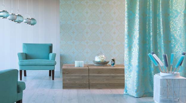
Color and style of curtains for turquoise wallpaper
Properly selected curtains for turquoise wallpaper are the key to the success of the entire interior. Most often, the design idea can be broken due to a small flaw, namely, improperly selected curtains in a turquoise interior. What curtains are suitable for turquoise-colored wallpaper and how curtains and wallpaper should be combined, we will consider further.
If your interior is not perceived as comfortable enough with a touch of cold, then decorate it with curtains in bright colors - pink, green, red, yellow and others. And if the room turned out to be bright and saturated, then use light-colored curtains, for example, the colors of diluted turquoise or soft pastel colors.

Turquoise color does not harmonize with curtains of opposite colors: therefore, you need to purchase curtains of the same color with wallpaper
If you have a solid wall color, then it will be much easier to choose curtains here, they can have patterns and rates, or just be solid. The colors present on the curtains must be repeated in the details of the interior.
The colors and style of curtains for wallpaper in delicate turquoise shades can be different:
- Light and light textiles will emphasize natural freshness;
- Dark fabrics will create the desired contrast;
- Bright curtains will help to enliven the atmosphere.
Curtains are suitable for patterned wallpaper, corresponding to the range of shades that will be found in the elements of the picture. The ideal solution would be if you select fabrics with similar patterns.
Additional accessories for curtains will help you emphasize the brightness and individuality of your turquoise interior. Various tiebacks with flowers, rings, bright bows, tassels and other elements will highlight the window area and give the room a unique style.
Turquoise wallpaper in the interior of the bedroom (video)
Turquoise can fit into absolutely any interior design, the main thing is to observe the compatibility of colors and proportions. Through combination, combination and combination, pastel colors will help calm the activity of turquoise, while bright colors, on the contrary, will reveal all its depth and potential. Feel free to bring your ideas to life and don't be afraid to experiment. Achieve unique styles of your rooms! Good luck!
Examples of turquoise wallpapers (photo)

The fusion of blue and green has created an incomparable turquoise color. It is like the color of the sea: fresh and so pleasing to the eye. This color looks great in the interior and is suitable for both the bedroom and other spaces. Turquoise in the interior has also become popular due to its effect on the human condition. And turquoise wallpapers are practiced not only in guest and sleeping areas, but also in the kitchen, where the presence of light is so important. And the property to successfully harmonize with white distinguishes this color from others as benevolent for the kitchen.
In favor of enhancing the effect of a unified interior design, it would be good to choose elements of turquoise, such as pillows or other accessories. If you choose a wallpaper with a turquoise pattern and use this color in other decor elements, this will make it possible to expand the space and saturate the atmosphere with the positive properties of color. Vases and turquoise ceramics will be a great addition.
The magic of turquoise is well known in the countries of the East and in Africa. The color is well known to people who are fond of meditation because of its strong beneficial properties. It is used by psychologists practicing color therapy.
The very name of the color, although it comes from the name of the stone - turquoise, brings with it a reminder of the sea and its properties.

Gamma shades
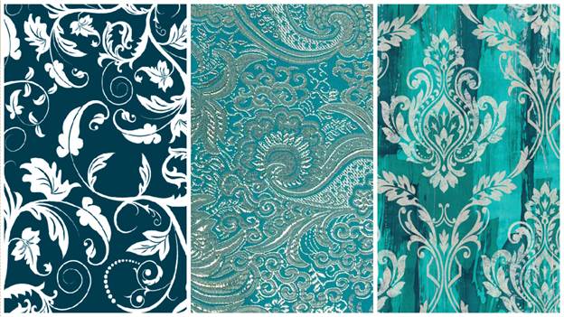
Turquoise is distinguished by a wide ability to combine favorably with other colors, and the palette of shades of this color is rich:
- Turquoise;
- Cyanogen;
- Aquamarine;
- As well as dark and light shades of the listed colors.
Wallpaper of this color is used in decor and to highlight one wall, in combination with various pieces of furniture of the same color, curtains and lamps. The color is very practical and does not require constant cleaning, it is not marks, so it will help in maintaining cleanliness and comfort in the apartment.
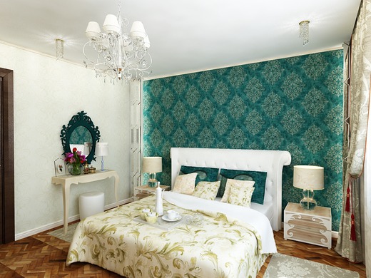
Wallpaper turquoise brown - it's luxurious
Wallpaper brown in combination with turquoise, white-turquoise and brown - these are options that have proven themselves especially in ethnic style and classicism.
Considering brown and turquoise in the natural environment, it can be noted that this commonwealth of colors is also the most harmonious.
Designers especially like to apply this color combination technique when they want massive brown furniture to successfully find its place in the interior. Of course, this is not a variant of simple minimalistic interiors, but expensive, prosperous bedrooms and living rooms.

Combination options
It is worth remembering that variations in shades greatly affect the overall effect, for example:
- Beige and turquoise, in a discreet form, will fill the space with warmth and create an atmosphere of well-being;
- Dark brown and turquoise, when implemented, will turn any interior into a luxury apartment;
- Turquoise and dark blue have a calming effect and imitate the state of sea waves in a light wind, this combination is ideal for bathrooms, therefore, in the interior of living rooms, it should be diluted with the most earthy color - brown.
A special, intriguing effect is provided by wallpapers reproduced in exact combination with the color of wood in the interior.
It creates an idyllic and noble look when combined with emerald turquoise.
Next, you should be guided by how much space is illuminated by daylight, how many windows are in the room and whether direct rays of sunlight fall, at what time of the day, etc. When answering these questions, it becomes clear how much brown and how much turquoise should be in the interior.

It is worth considering the most diverse combinations of turquoise and brown, in all their variety of shades, in order to understand how perfect this pair is.
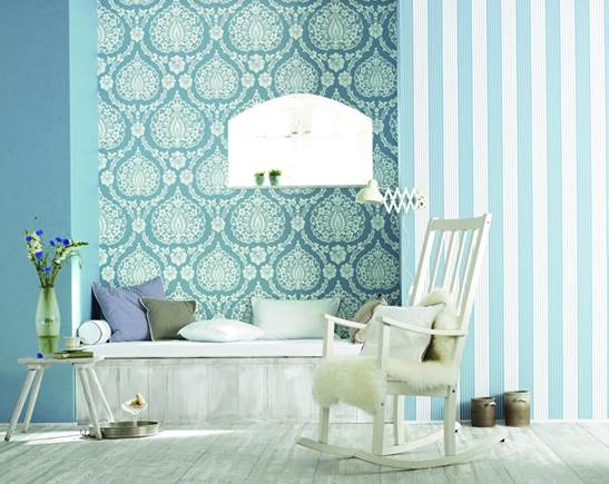
White-turquoise wallpaper in the house
There are many shades of turquoise that go wonderfully with white. The variety of design options, both in the color palette and in the pattern, is discouraging, the choice is so wide. There are many reasons for that. These two colors, interacting, create a feeling of paradise, so carelessly they "play" with each other.
Here are some design finds embodied in the wallpaper pattern:
- A small floral pattern on a white background is one of the favorite themes of Provence;
- The most daring drawings in their structure will successfully embody turquoise, this color is quite restrained, there is rarely too much of it and it never looks defiant;
- Perfectly harmonizes with gold, sand, these combinations are truly noble, expensive and at the same time the interior is not full of excess, these color combinations have a relaxing effect;
- The interior of the room looks interesting and very skillfully executed using several shades of turquoise.
A good choice - highlighting the walls with different wallpapers, the ability to switch from turquoise to white-turquoise and white - a real masterpiece of decor.

Species merits of color
A few advantageous features of white-turquoise wallpaper:
- A very practical choice to pair with a white ceiling and white tulle;
- Looks win-win in places of summer holidays, for example, in a house on the coast and at the same time, contributes to the creation of a similar atmosphere in any room;
- It is difficult to overestimate the dignity of this color combination when choosing for the kitchen.
Turquoise is combined with all the colors of the palette, while white expands the space and fills it with air. Turquoise keeps from the excessive influence of white color, in perfect harmony with it.
Children's room with turquoise wallpaper
It is quite natural that this color is the right choice for the nursery as well. Turquoise wallpaper in the nursery can be presented both on its own and in combination with other bright colors.

The combination of light turquoise and pink looks very nice - you can give preference to this solution when choosing wallpaper for a girl's room.
In the boy's room, you can choose a darker shade that will look good with orange or options for blue and white. In many ways, the choice will depend on the furniture that is planned to be placed in the room: whether it will be light beige, white or brown. For turquoise and pink, very light furniture is more suitable.
For a nursery, you can also use a very bright shade of turquoise, to highlight individual zones - this is not boring and will delight the child.
When choosing turquoise wallpaper, you need to proceed from the style in which the interior is planned to be created, as well as what furniture will be according to its color palette. Then you can start choosing, so it will be much easier to navigate the assortment. Do not hesitate for a minute in choosing this color, it will bring extremely positive emotions, will delight you with its effect and fall in love with you every day, because then, conservatism, for example gray, will seem dull.
Turquoise wallpaper color in the interior (video)
By the way, gray is also combined with muted turquoise. Therefore, for those who want to “dilute” an overly gray interior with kinder and more pleasing colors, it is recommended to turn to turquoise details for help and “settle” them in the interior. It will be great!
Turquoise wallpaper in the interior (photo)


Turquoise, translated as "Turkish stone", is a mineral of an unusual color that has long attracted attention. Its shade does not belong to any known color, but is somewhere between blue and green. Moreover, the turquoise color palette is very rich - from light green with blue to blue cyan.
Interior designers have long paid attention to the turquoise variety, and factories produce many variations of wallpapers of similar shades.

What goes with turquoise
Many people like turquoise in the interior, but some are scared off by the activity of color. At first glance, it may seem that there are few colors that combine with turquoise, but in fact, this is a delusion.
Of course, this is an active color that requires a careful approach, because if you overdo it, you can overload the interior. It is important to find a middle ground based on the basic rules of combination:
- if turquoise becomes the base color, it should not cover more than one third of the surfaces;
- the rest can be decorated with wallpaper of lighter shades - in this case, you can take wallpaper of several colors at the same time;
- if, in addition to turquoise, darker wallpapers are supposed, then there should be no more than two of them.
Designers have found a lot of successful combinations with turquoise wallpaper, some of the ideas are quite unusual:
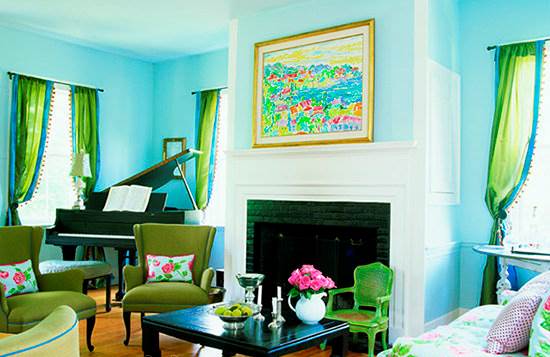
with orange
Turquoise and orange - a fresh, original combination. The subtleties of this design solution include the fact that light turquoise wallpapers should be taken as the basis. Furniture and interior items are more suitable for light, mother-of-pearl, cream tones. There should be one or two orange accents, for example, only a sofa, curtains and cushions, a picture and a carpet, etc.
The interior in a similar color scheme is perfect for a children's room, bedroom, living room in a youth style.
Photos confirm - bright accents favorably emphasize the tenderness of turquoise walls.

with bright yellow
Another "sunny" version of turquoise in the interior is worthy of attention. With yellow, you can be bolder by combining with turquoise wallpaper and adding bright accessories.
The photo shows children's rooms, but such mischief can be created in almost any room, there would be a desire.


with light green
It is a completely natural combination, because these two colors are natural shades. Here you can trace the harmony of the azure sky and fresh grass, it blows with the warmth of a spring day.
The photo shows the bedroom and living room in turquoise-light green shades.

with terracotta
Terracotta, like turquoise, is a borderline shade, only between orange and brown.
Experts recommend in the interior to adhere to the saturation of the palette of both shades - combine bright turquoise with juicy terracotta, select furniture and accessories without shine, mother-of-pearl for matte wallpaper. If the turquoise wallpaper is a muted color, then the terracotta should be calm.
Photo - an example of a bold combination of colors:

What a calm palette looks like - shown in the photo:


With pink
Pink brings to mind thoughts of love, romance, comfort, and together with the turquoise color of the wallpaper creates a wonderful tandem.
Most often, cold shades of pink are used with cool turquoise. This refreshing combination is perfect for little princesses' nurseries.
With all pastel colors
The turquoise color of the walls can be safely combined with beige, cream, vanilla, caramel shades. The palette of pastel colors is rich in tones, so there is plenty to choose from to suit your taste.
This combination is not catchy, it has a calm color scheme and causes peace. It can be used in the interior of newborns, hyperactive children, bedrooms.
with chocolate
Tasty and noble tandem - turquoise and chocolate. She is cool, bright, he is warm, rich, and together they look very harmonious.
There are many variations - turquoise walls are combined with chocolate-colored furniture, several types of wallpaper are combined, or the color of turquoise walls and the same furniture is complemented with “delicious” accessories.

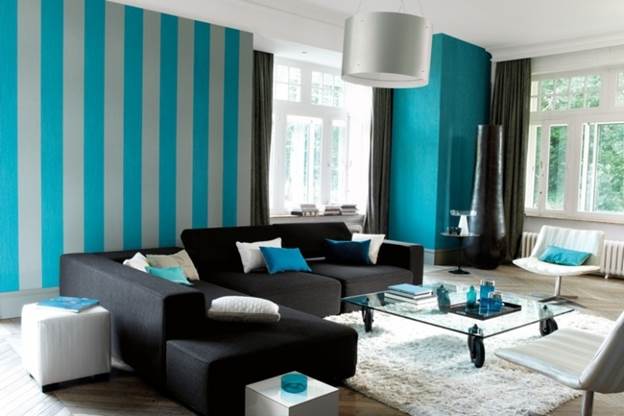
With black
Black is the most classic that is always relevant. The color of purity and conciseness, used in the interior, fills with freshness, novelty. It does not dampen the brightness of turquoise, but only successfully emphasizes its dignity.
In most cases, these two colors are used for the design of walls and the interior of living rooms - photo:

There are design ideas for using the turquoise-black range in the bedroom:

With white
Looking at the turquoise-white interior, only one word comes to mind - tenderness. Light turquoise wallpapers are taken as the basis. This is a 100% successful option for the bedroom, which will give a feeling of calm, coolness and relaxation, just what you need after a hectic day.
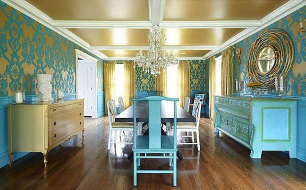
With gold
Gold has always been a sign of luxury, turquoise is also a natural wealth. These two colors are suitable for luxurious, status interiors, replete with carved furniture, massive lamps, antique figurines and other attributes of rich decoration.
In such an interior, wallpaper with a turquoise pattern on a gold background harmoniously looks.

With silver
If metal has been used for a long time and quite often for the manufacture of furniture and accessories, then it is used much less frequently for decorating wall coverings. The color of silver gives the interior some coldness, however, in combination with the turquoise tint of the walls, it looks very aesthetically pleasing. But in this combination there are also pitfalls - with very bright lighting, a lot of glare appears, so the light should be in moderation.

With red
And one more example of the turquoise color in the interior, proving that there is no concept of “correct color combination” in design, but only a successful selection of colors that suit this particular room.
The turquoise color of the walls and red accents are a protest against boredom and monotony.


Turquoise hospitality - living room wallpaper
The living room, or as the room is also called - the hall, is a place for receiving guests. Interior design in this case has an important goal - to create a friendly, welcoming atmosphere.


In addition, the following tips may be helpful:

The photo shows that turquoise goes well with furniture of the same color, white surfaces, everything looks organic. A small yellow accent gives liveliness and brightness;
However, wallpaper in saturated colors, with a large pattern, is best combined with light solid colors or those with a neutral pattern - waves, stripes, embossing:
Turquoise wallpaper in the bedroom
The bedroom is a place to sleep and should be suitable for proper rest and relaxation. Designers do not recommend using a large number of contrasting elements, bright colors. All combinations of wallpaper should be in harmony with each other and not "cut" the eyes.
But these are not always light, pale colors. Bright turquoise wallpaper can be used to decorate the walls of the bedside area.

For a classic design, you can use turquoise wallpaper in light shades, both plain and patterned.

In this case, it would be appropriate to dilute the interior with a piece of furniture or an accessory of a more saturated, bright color. In the photo, this role is played by the carpet.

Turquoise wall colors are a fresh, stylish solution. The design uses a palette of unique tones offered by nature itself.
The turquoise color of the wallpaper in interior design can be seen in the following video:


 in the near future - forecasts and expert opinions")


 in the near future - forecasts and expert opinions")


