The interior in pastel colors will look not only beautiful, but will also have a beneficial effect on the psychological state of a person. Even bright colors diluted with a white tone will be pleasing to the eye and create a relaxing pleasant atmosphere.

Design features
Pastels are shades diluted with white. Visually, it looks like a white veil has been applied to an ordinary pure tone. The result is a pleasant, light shade.
- Given the nature of the pastel palette, it would be a good interior solution to use it to decorate small spaces. Light wallpaper will visually enlarge the space.
- Pastel goes well with white and gray tones, as well as with brighter manifestations of its shade.
- Pastel colors look good both as a background and as accents.

For rooms with windows facing north, it is better to choose warm-colored pastel wallpapers, such as yellow or peach. Cold tones, blue, mint, lavender are suitable for the south side.

Color selection
pastel pink
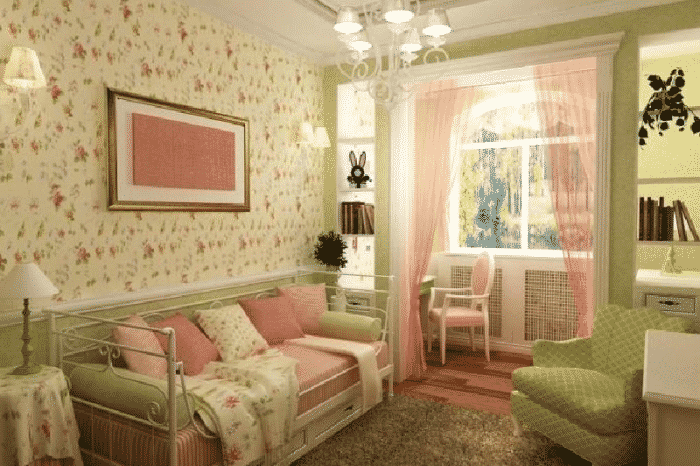
An incredibly gentle and light pastel tone is associated with powder-colored rose petals. Pale pink wallpaper looks good in the interior of a children's room for girls, bedroom, living room and other rooms in the house.

pastel yellow
Positive sunny unobtrusive pastel tone. In the interior, it will look harmonious with neutral base colors such as white and beige. Pale yellow wallpaper will brighten up a room whose windows face the north side.

Light peach and light coral
Tones close to each other will add color to the interior and make it brighter. They will look harmoniously with turquoise and blue. Peach will be harmonious as the base color of the walls. Coral tone is more suitable as a bright accent.

Pastel lilac and lavender
Pale purple is successfully combined with white and gray. The perfect wallpaper tone for decorating a living space in a classic style or Provence, the design will turn out to be fresh and cozy.

Pastel green and mint
Pastel green walls not only look refreshing, but will also have a positive effect on the psychological side of a person. Mint is a suitable option for an interior in the style of shabby chic and Provence, green shades will look warmer.

pastel blue
Pale pastel blue will be associated with the summer sky and clear water. Cold shades of wallpaper are best used for interior decoration with south-facing windows.

Cream, ivory
Creamy pastel wallpapers are ideal as backgrounds, they are not as bright as white and look much softer. Both shades of pastel will be harmonious in a classic and modern style. The interior can be diluted with details of other, brighter colors.

The photo shows a minimalist ivory kitchen, part of the facades is decorated with wood.
Wallpaper in pastel colors
plain
Pastel plain wallpaper will become an elegant backdrop in the interior. The walls can be decorated with wallpaper of the same color, thereby giving free rein to the choice of furniture and decorative parts.

With pattern or pattern
Drawing or ornament on the wallpaper plays an important role in the overall picture, it emphasizes the chosen style of the room.
- Geometric patterns or stripes will decorate a modern interior;
- Ornate monograms correspond to the classical direction;
- Cute floral patterns on the wallpaper are suitable for a shabby chic design;
- Imitation of any material, such as plaster or brickwork, will decorate the interior in a rustic or Provence style.

The photo shows a Provence-style dining area. The walls are covered with pastel wallpapers of a purple hue in various manifestations.

Wall mural
Wallpaper with photo printing allows you to make the interior completely unique. Pastel photo wallpapers can decorate one or more walls, thereby becoming a gentle accent in the interior.

The photo shows a children's room in a marine style, the design is predominantly white and pale blue pastel, one of the walls is decorated with wallpaper with photo printing.


Textured
The wallpaper has a pleasant embossed surface that forms a variety of images, it can be floral patterns, geometric shapes, imitation plaster or other patterns. In combination with pastel colors, you get an interesting and discreet design.

The photo shows a design for a nursery with textured liquid wallpaper in light yellow tones.
Photo in the interior of the living room, kitchen
The hall and the kitchen are the places where a lot of time is spent, during repairs it is worth choosing the most pleasant palette for wallpaper so that over time it does not get tired, and the colors continue to delight.


The photo shows a modern living room in beige tones. A peach shade is used as accents in the design.
A few bright decorative elements, such as an ottoman, a picture, dishes or flowers, will “enliven” the interior and make it brighter.


Design of a bedroom, nursery
The bedroom and the nursery are the most successful rooms for decorating in a pastel delicate palette. The interior will be light and bright, the wallpaper will create a positive, non-irritating atmosphere.


The photo shows a neoclassical style bedroom, decorated in a white and peach palette.
In a nursery, pastel colors can serve as a background, and the content can be brighter. For a bedroom, a combination with a light, close to white shade will be ideal, the room will be romantic and airy.


Bathroom and hallway
One of the main advantages of light color is the ability to visually expand the space. In standard city apartments, the corridor and the bathroom do not have large areas, and the pastel colors will visually make them more spacious and brighter.


Photo in the interior of a country house
A delicate palette in a country house will look stylish, open spaces and large rooms will fill the house with light.


In addition to finishing, pastel shades can fill the interior with furniture and other details, for example, an antique pale green wardrobe will become the main object in the bedroom, and a pale blue wood set combined with linen textiles will make the kitchen sophisticated and romantic.


Furniture and decor
Furniture
Pieces of furniture in pastel colors can become both the main object of attention in the interior, and be a concise and inconspicuous addition. For example, a vintage chest of drawers or a velvet pale lavender armchair at the dressing table will certainly attract attention, while a cream-colored sofa or dining table will become more of a continuation of the design idea.


Curtains
Tulle of one color or another can change the perception of the room, for example, a light yellow or peach shade will make the room warmer, while blue, lilac or mint, on the contrary, will refresh it. Curtains made of dense fabric will hide from excess light, while saving space.


Textile
The textile part of the design makes the interior cozy. Pillows, throws and rugs are details that can change the mood of a home a little, making it playful, for example, with a floral pattern on a pink background, or romantic with plain soft lavender accents.


Paintings and posters
Paintings even in the same color palette can look completely different, depending on the writing technique and image style. The drawing may support a general stylistic direction or reflect a thematic idea.


Accessories
Decorative interior items are the finishing touch in creating an apartment design. Candlesticks, ceramic figurines or flower vases will add a romantic touch to the interior of the room. In the nursery, these can be beautiful dolls, soft toys or nightlights, in the kitchen, decorative wall plates or useful little things, and in the bathroom, a rug, boxes or cups for brushes and soap.


Style decision
Shabby chic
Shabby chic is the most comfortable and homely style that cannot be imagined without finishing and filling in pastel colors. Pastel wallpapers with a playful floral pattern, soft furnishings and lots of cute decorative elements will envelop the home in a cozy atmosphere. The colors most commonly used in shabby chic design are milky, mint, peach, pink.

Provence
Provence style is associated with the spaciousness and charm of endless lavender fields. Pastel accents on a white or milky background will make the interior airy and delicate. The walls can be finished with plain wallpaper, plaster, wallpaper with floral patterns or frescoes.


Modern
Style allows you to combine different colors and materials. In the design of one room, pastel wallpapers will harmoniously look, for example, with geometric patterns of the same color, but of different saturation. Furniture has simple forms, and decorative items emphasize the style of the room.

Classic
Pastel colors in a classic interior create an incredibly delicate and elegant design. The walls will be decorated with wallpaper with a slightly noticeable pattern, while elegant furniture and noble textiles will complete the look. The design can be left in one color tone or you can add a few bright colors in the form of paintings or fresh flowers.

Scandinavian
It is performed, as a rule, in light, soft colors. White is most often taken as the basis, multi-colored details act as accents, for example, pieces of furniture, textiles, part of the decoration. Details of any color will look harmonious.

On the picture
Nautical
A light range of turquoise, blue and beige will make the interior incredibly fresh and fill it with marine motifs. Delicate colors can be used as the main ones in the interior or as complementary ones.

A color scheme
Combination with neutral shades
To get the most light and delicate interior, the most successful combination will be with neutral shades, such as white and light gray. Both colors are harmoniously combined with almost the entire color palette, and in combination with pastel colors form a romantic and relaxing design.

Monochromatic
This is a combination of one color of different saturation, from white pastels to deep shades. In the interior, such a combination can be found in the decoration or in the filling of the room, for example, wallpaper with a smoothly transitioning pattern or a sofa with brighter pillows and blankets.

The diagram shows an example of a monochromatic combination.

The photo shows a stylish compact living room. When decorating, a monochromatic combination of lavender shades was used.
Complimentary
Opposite shades from the color wheel are considered complimentary, such as pale pink and blue. In the design of the apartment, this combination looks brighter and more interesting. Despite the colors opposite each other, the room will not be overloaded due to soft shades.


Similar
The shades adjacent in the circle will become a continuation of each other in the interior of the room. Shades are close to each other, but are not variations of the same color.

Pastel colors are formed by adding white pigment to deep colors. Saturated and translucent shades in the design design create the illusion of a large space. You will learn how to aesthetically compose cold and warm scales from the article.
Pastel colors in the interior create a chamber atmosphere, emphasize the depth of the dominant tone, level the contrast created by opposing colors, and are ideal for compromise combinations. Watercolor blurring of shades depends on the amount of the component. Drop white into red- and it will immediately turn pink. Throw them in green, and the associations will helpfully remind you of pistachio ice cream. According to this principle, numerous shades of 12 copies of the color wheel are obtained, which serve as a background for compositions or become the basis of a monochrome design.
Eclectic mixes dilute monosyllabic design in minimalist and classic styles, allow you to create new color schemes. Judging by the photo from the designer's portfolio, pastel colors are ideal for shabby chic, country, eco-style. Shades of the sun, sky and nature do not irritate with the intensity of colors, soothe. Therefore, a light range is relevant for decorating houses and offices. If the bedroom is decorated in soothing colors, then the nursery, kitchen, living room looks more interesting with bright fragments. The ability to combine a pale and bright palette - blue, brown, light blue, green, beige soften the brutal restraint in the interior of the men's bedroom, office.
Advice! Notice which pastel colors inspire or relax you. Take one as a basis and match them with companion colors. Inspirational photos will help with the design idea.
How to decide on a color
Warm pastel colors are usually used in rooms on the north side. For decoration are selected peach, sand, yellow-orange, beige-brown pigments.
Cold is considered to be light ultramarine, turquoise, blue, pearl, grayscale. The palette is good for large rooms in the southern part of the house. For example, a fashionable mint shade in accessories, upholstery, curtains in harmony with the ivory walls. Other decor options can be selected from the photo.
If you do not dare to experiment with schemes, refer to the ombre technique - color stretching, which implies a smooth transition from light to saturated tones. First, decide on the color scheme, select spectral shades for it. To get an idea, look at the photos, which show a smooth color transformation. Which tones to make dominant depends on personal preferences. Then pick up decor items for them.
- Fashion trend for a girl's bedroom - fuchsia, fading to dark gray and pink, soft lilac gradient flowing to pink and white.
- In the interior for a boy, classic white-blue is often used with a transition to intense blue or mother-of-pearl - blue - cobalt, pale purple - lilac - purple.
- Scheme: beige - cream - brown is good for an office, bedroom. Can be changed beige on yellow and decorate the living room with such colors.
Advice! When creating a monochromatic design, duplicate the shade of the headset on the walls. curtains you can choose from a photo a tone brighter, patterned or combine them with a colored chandelier, tablecloth. Then a laconic background will enhance the depth of the colors used in the decor.
An eclectic mix of cold tones in bathroom interior gives objects and design expressiveness. So, the blue bowl next to the turquoise frame of the mirror or the facades of the cabinet effectively stands out against the background of light walls, emphasizing the texture of the finishing material. In a small perimeter, peach, mother-of-pearl, pink and other light pigments have an advantage.
Wallpaper is a classic option for decorating the walls of any living space. Any newcomer or a person making repairs in his "nest" often asks the question: "How to choose the color of the wallpaper?". The right choice is influenced by many different factors: the purpose of the room, its dimensions, the number and size of windows, which side the windows “look” at, what style the interior of the room is designed in, and much more.
Over the past decade, technologists and designers in the wallpaper industry have been vying to surprise buyers with an endless variety of patterns and textures. There is a huge selection of materials from which wallpaper is made.
- Textile. Their top layer consists of fabric material - cotton, silk, viscose, polyester, linen, etc.

paper wallpaper
Paper wallpapers are a budget option, however, modern technologies produce high quality products and a rich assortment.
There are different types of paper wallpaper:
- Simplex- just one layer and a smooth surface.
- Duplex- two (sometimes more) layers and a textured surface. They are good if you want to paint the wallpaper.
- moisture resistant- they can be washed.
Advantages of paper wallpaper
- Low cost.
- Environmental friendliness.
- The richest assortment of patterns.
Disadvantages of paper wallpaper
- Small service life.
- Susceptibility to mechanical damage.
- UV resistance.
- Paper wallpapers can not be wiped with a damp cloth (unless they are moisture resistant, but you should not overdo it here either).
- They do not hide the defects of the wall, moreover, the walls for such wallpaper must have a perfectly flat surface.
Such wallpapers are made by applying a vinyl coating to a paper (sometimes fabric) layer. Polyvinyl chloride coating can be smooth, embossed (silk-screen printing) or foamed. The second coat is the ideal base for painting.

Foamed vinyl wallpaper
Benefits of vinyl wallpaper
- Strength.
- Durability.
- Water resistance.
- Ease of maintenance.
Disadvantages of vinyl wallpaper
- At first, there is an unpleasant smell of plastic, which then disappears.
- Does not allow air to pass through, does not allow the walls to “breathe”.
This is a win-win option for almost any room in the apartment. Designers often advise making one of the walls of the room different from the others. If the area allows, photo wallpapers can be glued in the hallway. The view of the seashore or the Eiffel Tower will make this room original and mysterious. In the living room, a forest landscape, a view of a night city flooded with lights, or a wonderful flower arrangement will make the entire interior of the room “play out” in a new way.


Each type of wallpaper has its pros and cons, characteristic features and even gluing methods. In each room, the choice of "clothing for the walls" must be approached creatively and in any particular case, find the best option.
How to choose the right wallpaper
- It is imperative to take into account dimensions of the room, number of windows.
- When choosing the color of the wallpaper, you need to take into account what where do the windows look . For those “looking” to the north and east, it is better to use wallpapers of bright and warm colors, and to the south and west, it is permissible to use a palette of cold colors.
- Of great importance are texture and coating material . For example, gold or silver threads in the pattern will emphasize luxurious furniture and textiles.
- When choosing one or another type of wallpaper, you must certainly consider interior style in which the room is furnished.
- It is necessary to thoroughly clean the walls of dirt and remnants of the old wallpaper.

- Before gluing, it is necessary to make the surfaces of the walls smooth and, preferably, prime them.

- All manufacturer's recommendations for gluing must be followed. So, non-woven wallpaper does not need to be smeared with glue, but paper ones do.

- Almost all modern wallpapers are glued end-to-end.

- If the wallpaper has any drawings or patterns, then most often you have to make pattern fitting
- combining the patterns on the previous canvas with the patterns of the next canvas.
Wallpaper fit example
- It is recommended to carry out pasting works in one room in one day.
- A draft must not be allowed in the room where the wallpaper is pasted until the wallpaper and glue are dry. Otherwise, they will just start to peel off.
How to choose wallpaper in the hall
The living room or hall is the front room of the apartment. Family celebrations are celebrated here, guests are invited here. In the living room, every, even the smallest, detail of the interior should be thought out. Proper wall decoration is of great importance. It is necessary to decide whether they will all be decorated in the same way (now the trend is to highlight one wall, make it different from the others). What type of wallpaper is suitable here to create a stylish and magical look? Wallpaper should not only have a beautiful color and pattern, but also fit perfectly into the interior.
Wallpaper for the living room in a classic style
Classic style is a combination of luxury and elegance, impeccable taste and refined interior. Solid wood furniture, carving, gilding, stucco on the ceiling, expensive textiles are all classics.
Modern ideas of motifs and patterns for a classic interior are very diverse:
- Striped(alternating olive and cream colors) are perfect for dark wood furniture;


- miraculous floral motifs on a light background(and so on).


Competently selected types of wallpaper in a harmonious combination with furniture upholstery and curtains will create a fabulous interior and a special microclimate.
Art Nouveau wallpaper
This style has recently regained its former popularity. In this case, both plain wallpapers and options with drawings depicting flowers and butterflies will be good. The "brand name" of modernity are geometric patterns, such as zigzags. One of the characteristic patterns inherent in Art Nouveau is the "flowing" line.


Wallpaper for the living room in the style of Provence
This wallpaper uses delicate floral arrangements made in pastel colors. A small floral print will go well with the pattern on the curtains and upholstery.


The color of the walls is a very important element of the interior. It can be in contrast to the overall decor of the room or, conversely, merge with the tone of the furniture and various accessories. With one or another color, a certain microclimate and mood are created.
White wallpapers expand the space, add light. This color blends perfectly with any other and serves as a great backdrop for furniture. Various shades gray color great for creating a sophisticated modern design. Wallpaper in pastel colors (lilac, sand, beige, light green and others) create an atmosphere of calm and tranquility. Brown wallpapers are in perfect harmony with light furniture, emphasize its beauty, and different shades yellow color add light to rooms facing north.


The bedroom is a kind of "safe haven" in which a person has a rest after a hard day or a long journey. In the morning, in this cozy room, he cleans himself, "cleans his feathers and spreads his wings." The decor of the bedroom should give physical and mental peace, and, at the same time, charge with vivacity and energy.
When choosing wallpaper for the bedroom, be sure to take into account the influence of different colors on a person's mood. Here are some important points to keep in mind:
- Wallpaper should be in harmony with the floor, ceiling, furniture;
- For a bedroom facing north, it is better to use wallpaper in warm colors, if south - cold;


white wallpaper
This color is universal. It goes well with any other color. It is a symbol of purity and freshness. So that the white bedroom does not evoke associations with the hospital ward, you need to add bright accents - paintings, photographs in color frames, original multi-colored panels. Such a room looks luxurious, but keep in mind that it must be maintained. in exemplary purity , since white and disorder are incompatible concepts.


Pastel wallpaper
A muted range of pale pink, light blue, mint, lavender shades is the best option for admirers of romantic, elegant interiors.


Gray wallpaper
This wallpaper color should be used with care. Solid gray can be dreary, but if you dilute it with silver or pearl, you get an elegant, charming interior. This color is the best for modern or minimalism.


blue wallpaper
The wonderful colors of a calm sea or a cloudless sky have a calming effect on a person. They can be combined with silver tones, with various shades of beige and gray. For the bedroom, blue and azure colors are good.


yellow wallpaper
If you use yellow wallpaper, then, of course, not a flashy, "chicken" shade, but calmer options - gentle light colors. Such wallpaper is perfect for the northern bedroom, will cheer you up on a cloudy day. This color goes well with green, orange, gold.


green wallpaper
Green color has a calming effect on the human nervous system, extinguishes negative emotions. There are many shades of this color: light green, malachite, peppermint and many others. It goes well with various natural colors: different shades of yellow, brown. Such wallpapers are optimal for southern and western bedrooms.


Patterns and ornaments
Monochromatic wallpapers are used extremely rarely, a variety of patterns and ornaments are used much more often.
Very popular in the design of wallpaper patterns are different stripes. It must be borne in mind that vertical stripes "increase" the height of the room, and horizontal stripes "expand" it. For large rooms, wide stripes are preferable, and for small ones, narrow ones.


Ornaments are often used in wallpaper designs. It should be borne in mind that in a tiny bedroom wallpaper with a small pattern will be appropriate, while in a large one a large pattern will look great. Wallpaper patterns in this room should be modest and discreet.


When choosing the wallpaper color for this room, some important factors must be taken into account: the number and size of windows, the dimensions of the room, and the style of its design. It is very important where the windows go. For northern windows, the use of dark or cold tones is not recommended. Light colors: beige, yellow, milky will add warmth and comfort to the room.
dark colors
usually reduce space, so they are not recommended for small kitchens. Also, in a small room it is undesirable to use flashy tones, as they can irritate people. In spacious rooms, on the contrary, you should use saturated, bright colors
.


If you like Red color , then you can use cherry or coral shades. Saturated bright red will irritate over time. Good for southern cuisine blue and cyan colors . Believed to be good for digestion pistachio and mint colors . Universal for all options white color.


It is impossible to paste over the kitchen with very dark wallpaper, since this color acts depressingly, and besides, it evokes associations with dirt, which cannot be allowed in the kitchen.
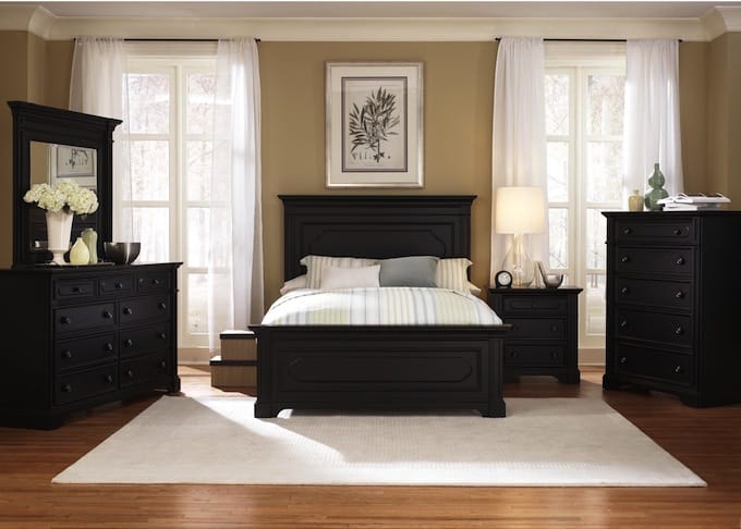
The choice of wallpaper depends on the color and design of the kitchen furniture. For dark kitchen sets
delicate shades of beige are suitable.


For popular now beige headsets suitable beige and sand shades, as well as white. White wallpaper with a dark pattern will look original. Unexpectedly and brightly, monochromatic lilac wallpapers look against the background of a beige headset. Light green wallpaper or burgundy color is acceptable (with a minimum of decor).


For white headset you need to choose a white wallpaper with a graphic pattern, stripes or photo wallpaper.


To orange furniture you need to choose wallpaper in gray or light green shades. For red furniture, use a beige palette wallpaper. Pastel colors will favorably set off the green set. In this case, lilac or purple shades are unacceptable.


To yellow headset you need to choose a wallpaper pastel, white or different shades of green. The gray or straw color of the wallpaper is the best fit for the blue headset.


To black headset
you need to choose a wallpaper in white, gray or (for a spacious kitchen) terracotta. 


The choice of wallpaper color is influenced by which side the windows are on. For northern windows, you need to choose warm colors (for example, apricot), and for southern windows, cold shades are preferable - blue, green.
The choice of wallpaper color also depends on how many windows are in the room, and whether they are large or small. If the room is well lit, you can use dark colors - brown, blue, terracotta. In a room with subdued lighting, metallic wallpapers (golden, silver) look mysterious.
Under the action of sunlight, blue and blue wallpapers fade and visually appear grayish in poorly lit rooms.
The color of the wallpaper can be chosen according to the color of the furniture, floor, textiles and even the decor of the room.


Monochromatic wallpapers are used quite rarely, “clothes for walls” with a pattern are more popular. Drawings may be different:
- Large.
- Small.
- Contrasting.
- Blurred.
- Rare.
- Frequent.
If the elements of the picture are large and often located, this visually “shrinks” the room. Rare and small details - "increase" it. A large pattern draws attention to itself, and a small one is the backdrop for the interior of the room, focusing on beautiful furniture and decorative elements.


The stripe is a universal pattern that will be combined with all elements of the decor in any interior style. Vertical stripes "raise" the ceiling of the room, while horizontal stripes "enlarge" the area.


With proper use of wallpaper, you can not only furnish the room in an original way, but also hide all wall defects.
The first impression of the apartment is created in the hallway. This room is sometimes called the "business card of the apartment." Equally important is the correct selection of wallpaper in the hallway. It should be taken into account that there is objectively a lot of dust here, which is brought with street shoes, clothes, bags. Ideally, here it would be necessary to glue washable wallpaper .
You should not use too light wallpapers for the hallway, as they will quickly become dirty. But dark shades are also undesirable, because the hallway, as a rule, is a small room and such tones will make it even smaller, and even add gloominess.


The best options for covering walls in the corridor will be the following options:
- Glass fiber. Can be repainted several times, not afraid of washing and cleaning.
- Liquid. Hide all the bumps, do not tear or crack. Can be dyed.
- Metallized. They brighten up the room and create a magical impression.
- Paper. They are inexpensive, but if desired, they can be changed often.
- Textile. With their help, you can create sophisticated interiors. Disadvantage: afraid of high humidity.
A few important tips:

The children's room is a special world. Here the child draws and sculpts, reads and does homework, and also runs, jumps and plays mischief. It is necessary to correctly, wisely, decorate its interior. What color wallpaper can I choose here?
Wallpaper in the nursery should be selected taking into account the age and gender of the child. As they grow and mature, the perception of colors also changes. For the smallest children, it is necessary to decorate the room in light and gentle colors.


For preschoolers who are beginning to explore the world, you need to add bright colors, but. as they say, "without fanaticism." Excessive use of flashy colors can be too exciting for the baby.


At school age, the formation of character occurs. In the interior, it is desirable to use a reasonable balance between calm and bright colors. Rooms for teenagers should be furnished taking into account the gender of the child and his preferences.


For girls, a gentle fabulous palette of colors (lilac, mint pink) is most often chosen. For boys, rooms are sometimes made in a marine style, a combat blue-and-white scale is used.


Often in this room they resort to zoning , highlighting areas for different activities of the baby. In the sleeping area, wallpaper of soothing shades is glued, for example, light blue, beige, pale yellow.
In the play area, bright juicy colors (red, orange, emerald green) are acceptable. It is better to learn lessons in a corner in which the walls are covered with calm shades, for example, mint or lavender.


Designers suggest using large colorful drawings in children's inserts, as well as using clean canvases for the work of small artists, changing them as needed.
First of all, take into account two little tricks:
- If you need to hide the flaws of old furniture, use bright wallpaper that will attract all eyes.
- If you need to focus on stylish and elegant furniture, use wallpaper in neutral, soothing shades.
To white furniture wallpapers of absolutely any colors and shades are suitable. One caveat: to prevent the color of furniture and white walls from merging, use paintings, panels or bright accessories.


brown furniture it will look luxurious if green, blue, pink, yellow, beige and golden colors are used in the wallpaper.


At colorful furniture pastel-colored wallpapers will be good, as well as plain and patterned wallpapers that use colors and patterns of furniture or textiles.


To dark furniture it is necessary to select light plain wallpaper. Bright ornaments are acceptable, but in limited quantities.


An ideal option is when wallpaper and furniture make up a harmonious image, emphasizing all the advantages of each other.
It is necessary to take into account some important features of the various color combinations of the floor, walls and ceiling:
- Light floors, ceilings and walls add space. So that the room does not seem faceless, you can paste over one wall with bright wallpaper.
- Light walls and ceiling combined with a dark floor expand the space.


- Dark walls with light floors and ceilings make the room look lower and longer.


- Dark walls and floors with a white ceiling make the room look like a basement. It is necessary to add light elements to the walls.

For a variety of interiors, you can use wallpaper of two or more colors. When combining, it is necessary to highlight the main (so-called base) color. Then suitable shades are selected for it. You can combine colors close in spectrum.
The combination of wallpaper with a pattern and plain colors looks very nice. The background on the wallpaper with a pattern should match the shade of the plain wallpaper. The alternation of bright patterns with wallpaper in pastel colors also looks beautiful.


How to choose the color of the wallpaper in the hall, bedroom, living room, kitchen + 180 photos
The use of pastel shades in the reception room is quite common. Designers quite often resort to creating a color composition in pastel colors, due to the fact that combinations of such color shades are very popular.
It is generally accepted that a living room in pastel colors is an ideal option for most design styles. It is also believed that light shades of color are easy to use, and they will look good in any case. In fact, not everything is so simple. After all, the use of light shades of colors in the interior of the living room is associated with a number of difficulties, which we will discuss in this article.
What do we mean by the phrase "pastel colors" in the interior?
By the phrase "pastel colors" we mean light, bleached shades of colors. A feature of pastel colors is that among them it is impossible to find truly warm colors. Even colors such as red or yellow in a pastel variation will look much colder. Due to the fact that white is added to them.
White is a constant companion to any pastel shade. Because only on a white background is such a shade able to open up and demonstrate its design potential. If you use bright colored spots in a living room in pastel colors, then you need to understand that attention will be on them and concentrate. And no one will notice the light shades.
This and other points must be taken into account if you do not want to hopelessly spoil the design composition.
Horizontal and vertical surfaces in pastel colors
 Very often the basis of a color composition is created by coloring horizontal and vertical surfaces. Pastel colors in the interior of the living room show themselves perfectly if they are applied to the walls. In a room where light colors rule the ball, plain wallpaper in pastel shades of blue, pink, green or yellow seems to us an excellent option.
Multi-colored wallpaper in pastel shades can be a good option if there are no bright furniture or accessories against their background, otherwise it is better to stay on plain wallpaper. If when decorating the walls you want to use a pastel shade as a color accent, then it must be placed on a white background, for the reason that we have already mentioned.
A ceiling in pastel colors will look very beneficial, especially if you use cool colors. It will reflect light. And the room will seem brighter. The type of ceiling in this case will be of secondary importance. The main thing is to take into account the interior features of the texture, which was used to decorate the ceiling surface. A glossy pastel-colored ceiling has much more reflective properties than a matte one, but in bright natural light it can glare, which is pretty annoying for some people.
The matte ceiling is much more capable of absorbing the sun's rays, but thanks to the pastel shade, the room still remains quite bright. If you are decorating the walls and ceiling in pastel colors, then it is better to choose darker shades for the floor, wood color seems to be a good option for us.

Choosing furniture in pastel colors
Pastel colors in the interior can also be used in cabinet and upholstered furniture. Such colors can fully express themselves only in properly selected furniture, and choosing it, in some cases, can be quite difficult. Experienced designers offer some tips on choosing pastel-colored furniture, let's look at them.

Natural and artificial lighting of the living room in pastel colors
In the process of organizing natural and artificial lighting in a living room decorated in pastel colors, some nuances must be taken into account. At first glance, it seems that a room dominated by pastel colors is not demanding on lighting, but this is not at all the case. Let's see what features you need to consider when organizing lighting in a guest room with a specific color composition. 
- In a living room with such a color composition, you will need fairly intense lighting. It is better that the light from the sources comes out white, this will improve the visual perception of pastel shades.
- In small living rooms with low ceilings, ceiling chandeliers and lamps should be preferred. The color of the chandelier and lamps can be sand or gold, these shades are best combined with a pastel background.
- Do not neglect directional light sources such as spotlights and spotlights. Such lamps allow you to brightly illuminate certain areas of the reception room, which makes them more attractive.
Summing up, we note that pastel colors in the interior of the reception room can be an excellent basis for most color compositions. Walls, ceilings, floors, furniture and other interior items are decorated in pastel colors, the main thing is to apply light shades correctly, and in some cases this can become a problem. Good luck with your design endeavors!
Photo of living rooms in pastel colors


